
Visualize your data with charts
Introduction (00.04)
If you have a lot of numbers in your spreadsheet it really helps to visualize your data using charts. In this version of Excel it is much easier to select appropriate charts since Excel analyzes your data and recommends charts for you. In this video you will learn how to use charts to spot trends and you will learn how to use the updated charting tools to make your graphs really stand out.
Visualizing data with Recommended Charts (00:32)
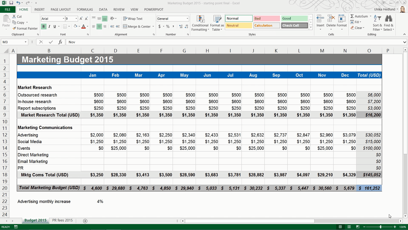
Here I have a sales report showing sales for 2014. To make this report more visual I am going to add charts.
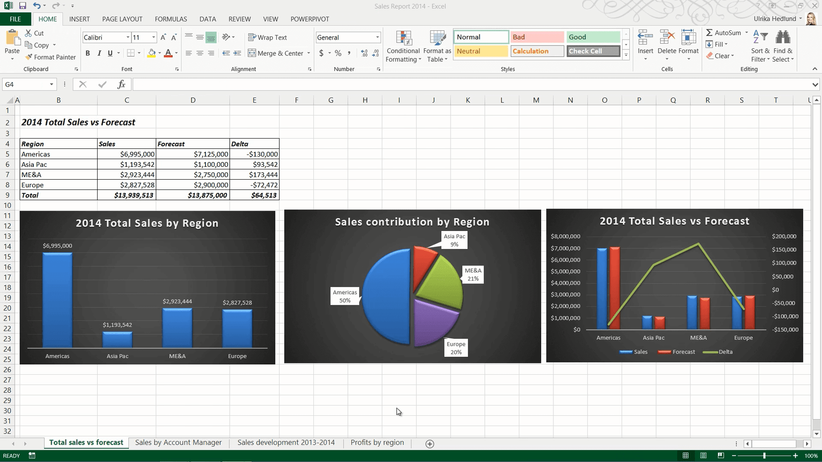
On this first worksheet I have a table showing sales and forecasted sales by region 2014. First I want to add a chart that shows only the sales by region. In Excel 2013 it’s much easier to select charts, since Excel provides you with recommendations.
To add a recommended chart, mark the data you want to include in the chart. In general it’s better not to include totals since the details might be hard do see. Click the “INSERT” tab, instead of manually selecting one of the many charts available in the Charts section click “Recommended Charts”. Excel will analyze your selected data and recommend the best possible chart to visualize it for you. You can click through the various recommended charts to see which one you prefer. In this case I prefer the first column chart so I’ll click OK to insert it into my spreadsheet.
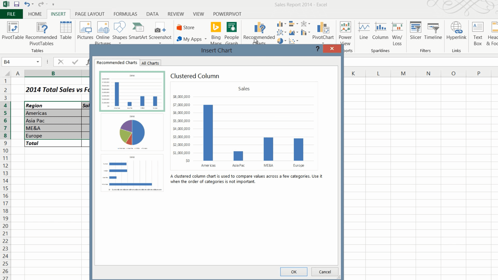
I’ll move the chart by holding down the left mouse button and dragging it to the desired position.
Modifying charts with the simplified Chart Tools (01:40)
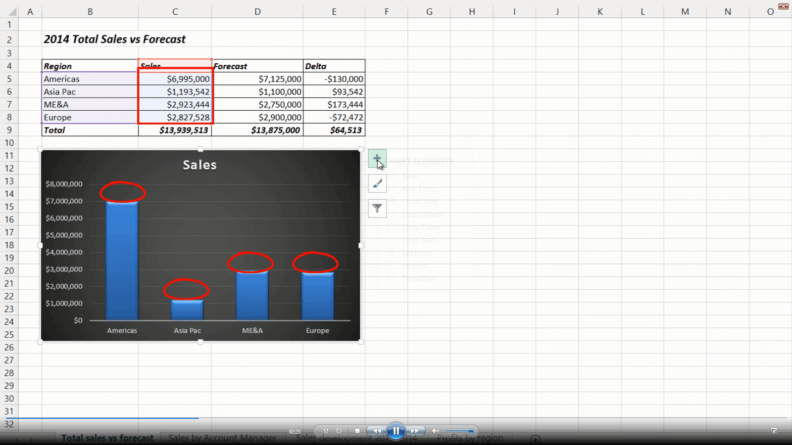
Now I want to make some modifications. In Excel 2013 Microsoft has cleaned up the Chart tools so that they are easier to use. To modify a chart, mark the chart so that the Chart Tools appear. Under the “DESIGN” tab, in the Chart Styles Gallery you get a live preview of what your chart will look like with different designs. I’ll select this dark design which provides better contrast. You can easily make modifications to your chart using one of the three buttons that now appear next to your chart. The first button gives you options to modify the chart elements, the second button the style and the color of your chart and the third the data selection. I want to add the sales results on top of each column so I’ll click the first button and mark the “Data Label” check box. Then I’ll click the arrow next to the “Axes” and uncheck the “Primary vertical axis”. Finally I’ll mark the title and write”2014 Total Sales by Region”. To close down the chart tools click anywhere outside the chart area.
Showing portions with pie charts (02.46)
Now I want to insert another chart showing sales contribution by region. I’ll mark the sales results again, click the “INSERT” tab and “Recommended Charts”. Here I’ll select the pie chart. I’ll move it and apply the same dark style from the Chart Styles gallery. I want to show the percentages for each piece of the pie so I’ll click the plus sign and check the option to show “Data Labels”, I’ll click the arrow to see more options and select “Data Callout”.
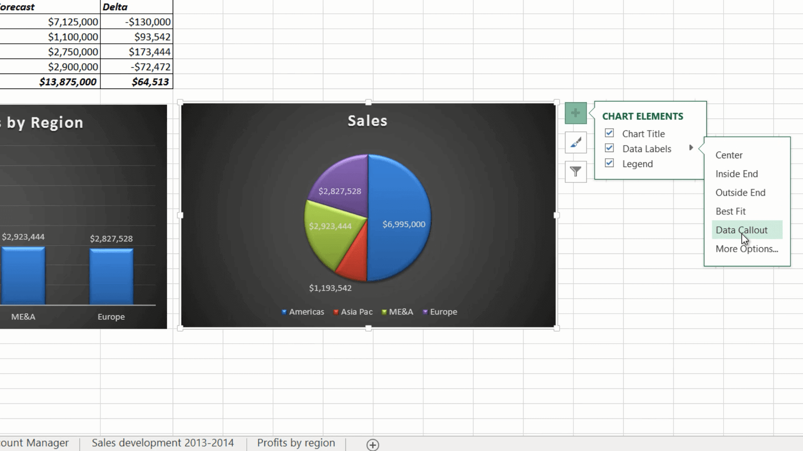
Then I’ll uncheck the option to show the legend. Now I want to change the rotation of the pie so that the Americas region is on the left. To open up the formatting tools for the data series just double-click the pie. The formatting pane is new in this version of Excel and makes it easier to make changes since the formatting pane doesn’t cover your chart. Here I’ll change the angle of the first slice with 180 degrees. I will also separate the pieces of the pie slightly by dragging the “Point Explosion” bar.
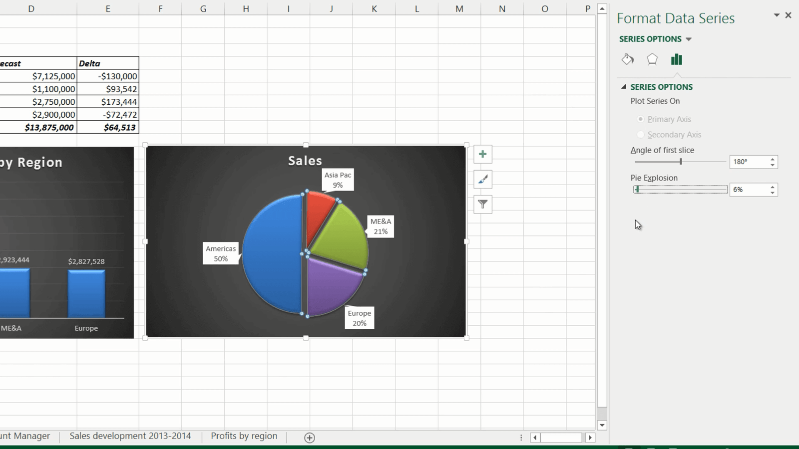
I’ll move one of the data labels by double-clicking it and then positioning it where I want it. Finally I’ll just update the title to “Sales contribution by region”. There, that’s looks great!
Inserting a combo chart (04:01)
Now I want to add a third chart that shows the sales versus forecast and the difference between the two in a combo chart. To insert a combo chart, mark the data you want to include in the chart. Here I’ll select the Sales, the Forecast and the difference between the two (Delta). On the “INSERT” tab, click “Recommended charts”, click the second tab called “All charts” and click “Combo” at the very end. Here you can select from a number of predefined combo charts. I’ll select this column/line chart. If your data series has different scales, select the option to insert a “Secondary axis”. I’ll add a secondary to the data series with the deltas. To insert the chart click OK.
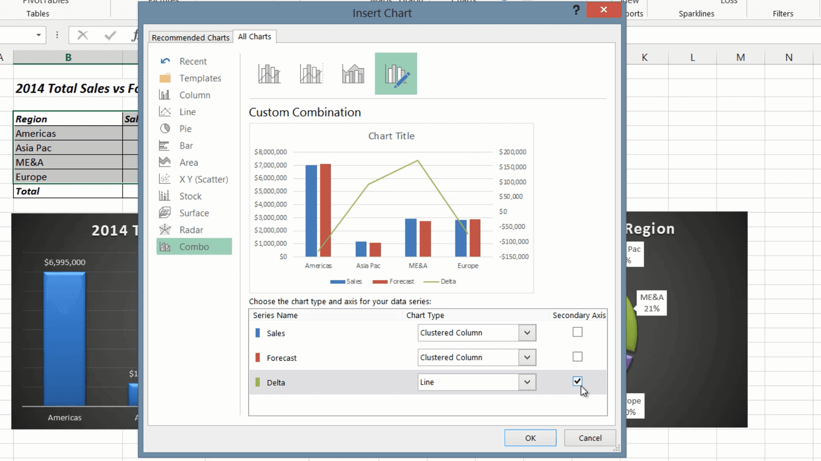
Now you have a combo chart that clearly shows multiple data series in one. I’ll apply a dark design from the Chart Style gallery. For the title of this chart I want to use the worksheet title. To link the chart title to text in your spreadsheet, mark the title and then write an equal sign in the formula bar, mark the title and press enter. The chart title is updated automatically.
Visualizing data with bar charts (05:10)
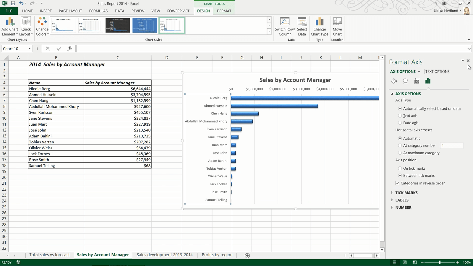
In this second worksheet I have a table showing sales per account manager. If you want to chart all data in a table, you can mark any cell in the table. I’ll click the “INSERT” tab and then “Recommended Charts”. Here Excel recommends a bar chart. The bar chart is typically recommended instead of the column chart if you have very long names for the items in the series like I do here.

I’ll move the chart and resize it by holding down “Shift” as I drag the bottom right corner to keep the proportion of the chart. I’ll add a nice design from the Chart Style Gallery.
Changing the order of items in a bar chart (05.44)
By default bar charts start with the first item at the bottom. When I have this chart next to the table it can be a bit misleading, so I want to switch the order of the items on the category axis. To change the order of the category names, I’ll open up the axis formatting pane by double-clicking the vertical axis in the chart. To change the order of the items on the vertical axis, mark the check box “Categories in reverse order”. There now the chart makes more sense next to the table.
Showing trends with line charts (06:17)
On the third worksheet I have historical data showing sales by region for 2013 and 2014. I’ll mark any cell, on the “INSERT” tab I’ll click “Recommended Charts”. Excel recommends a line chart. Line charts are great for showing trends over time. I’ll resize the chart and from the”DESIGN” tab I’ll select a nice design in the Chart Style Gallery. I’ll mark the title and link it to the title of my worksheet. I want change the layout so that the region legend is placed to the right next to the lines. To get a visual representation of various layouts, on the “DESIGN” tab, in the “Chart Layouts” section click the “Quick Layout” button. Here I can see an overview of various layouts, and here is the one I was looking for.
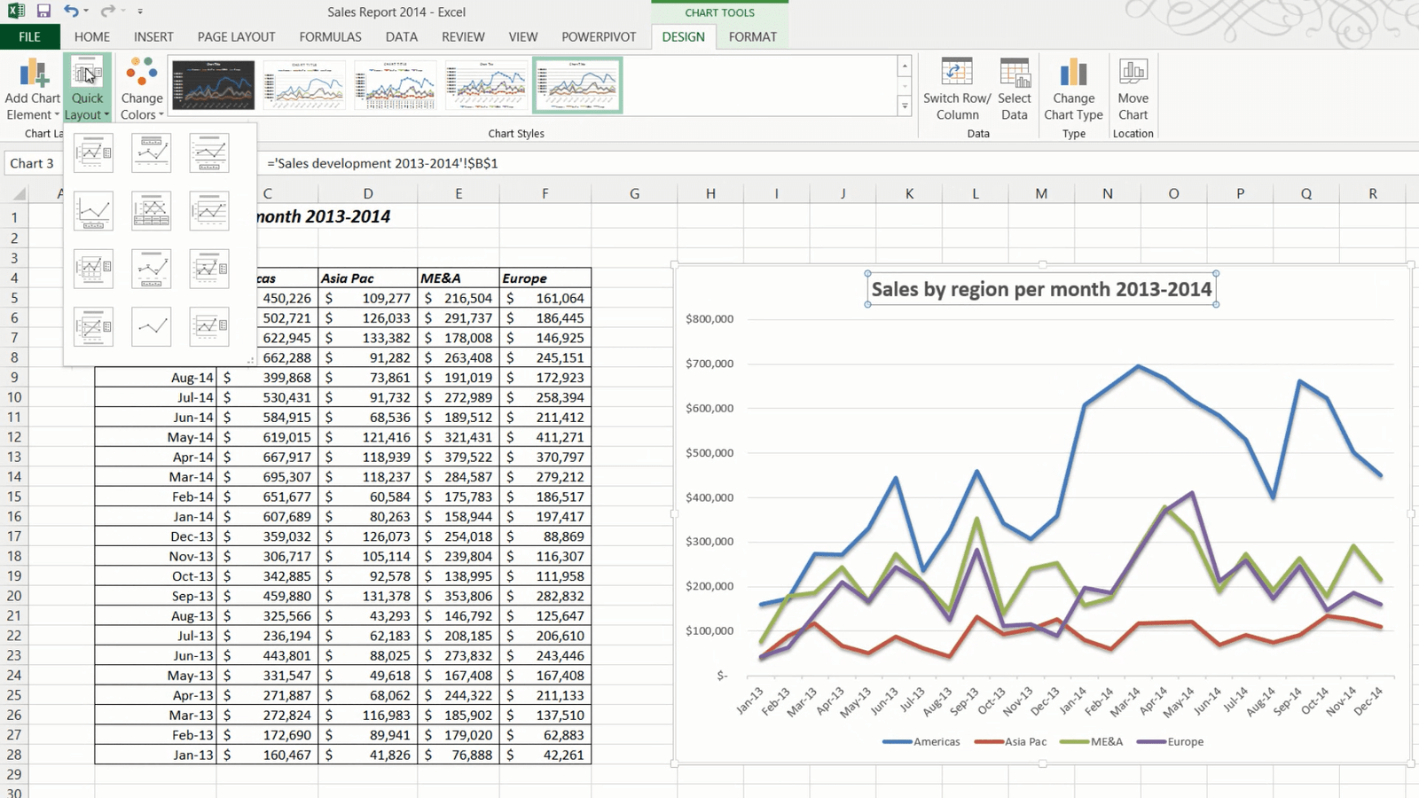
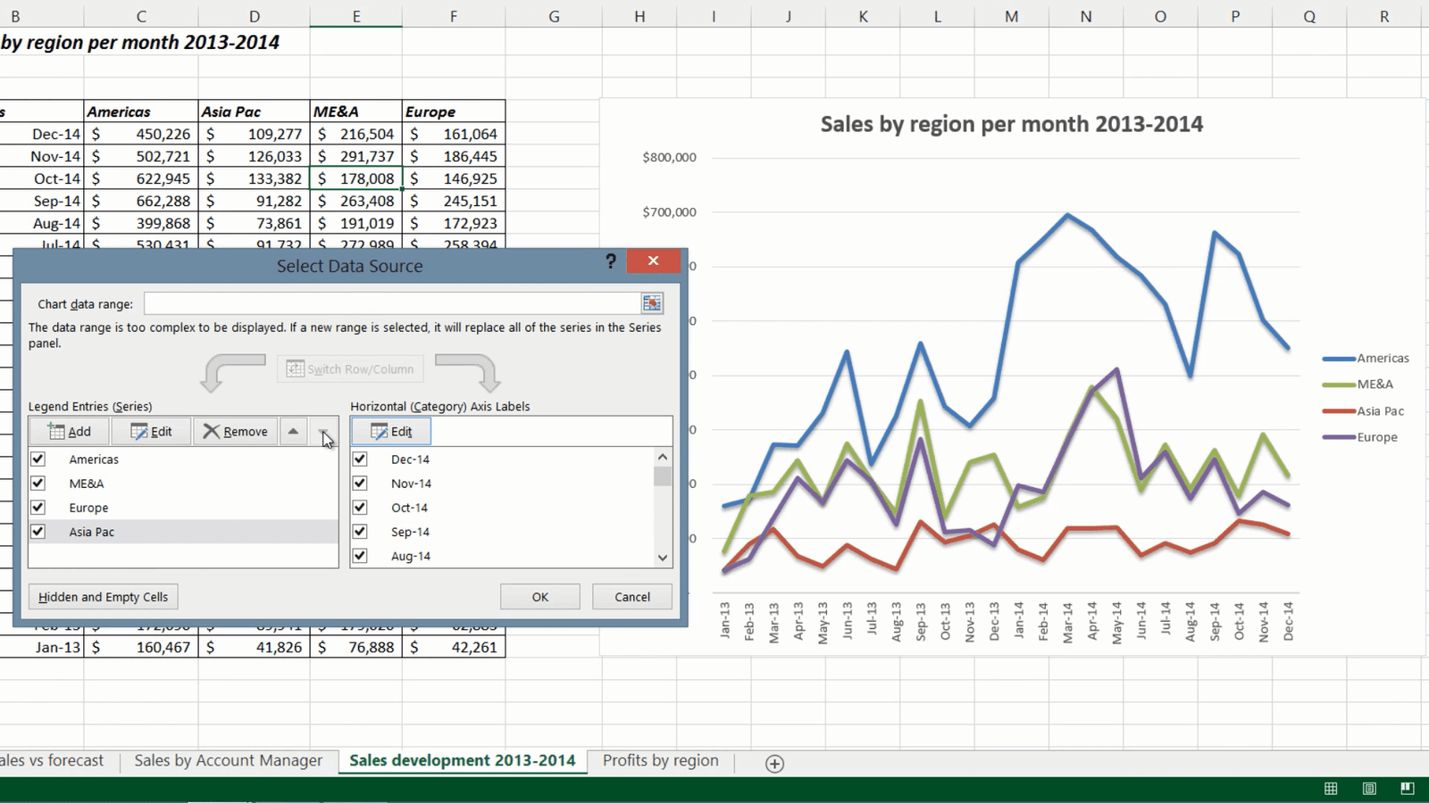
Changing order of the data legend (07:06)
As you can see the legend of the chart follows the order of the data in my table. But here it would make more sense to change the order to match the order of the lines in the chart. You can always change the order of the data in your table, but an easier way to do this is by changing the legend order in the chart. To change the order of the data legend, on the “DESIGN” tab, in the “Data” section click “Select Data”. In the Legend Entries window, mark the region you want to move and change the order by clicking the up and down arrows. To apply the change I will click OK. There, now the data legend matches the order of the chart lines. Finally I’ll just remove the Axis title by marking it and pressing Delete on my keyboard.
Using the Quick Analysis Tools (07:54)
In this last worksheet I have profits by region over time. Instead of inserting a separate chart, I will visualize the data in the table itself. In this version of Excel Microsoft has introduced “Quick Analysis”, a tool that helps you analyze your data.
To use the Quick Analysis tool, mark the data you want to visualize. A little Quick Analysis icon appears in the bottom right corner, click it to see the various analysis options available. Under the first “FORMATTING” tab, you can select data bars that show little bar charts within each cell, you can also select conditional formatting that colors cells based on their value relative to each other.

You get a live preview of all options so that it is easier to select one. Here I’ll select the “Color Scale”. I also want to show each month’s average so I’ll click the Quick Analysis button again and select “TOTALS” and then “Average”, now the average for each month is displayed under my table.
A little green triangle in the cells shows that there might be an error in the formula. Click the exclamation mark to see the error message. Here Excel warns you that the formula doesn’t include the adjacent cells. This is fine since we only want to calculate the average one column at a time, so to ignore all error messages, mark all cells and then click the exclamation mark and select “Ignore error”.

Finally I want to show the trend using Sparklines. Sparklines, which were introduced in Excel 2010 are tiny charts that fit into a cell. I’ll go to the “SPARKLINES” tab and select a line chart. As you can see tiny little line charts are inserted next to my table showing the trend over time.
Closing (09:43)
By knowing how to effectively use charts, you’ll be able to make your data much more visually appealing.
Use formulas to fill out a budget
Introduction (00:04)
Excel is a fantastic tool for calculating numbers. You have a wide range of functions and formulas to choose from. In this video you’ll learn how to use basic calculations to fill out a marketing budget template. You’ll also learn some shortcuts for how to quickly fill your spreadsheet with numbers, how to calculate sums and how to use absolute and relative references. Let me show you:
Using “autofill” to automatically fill cells with values (00:31)
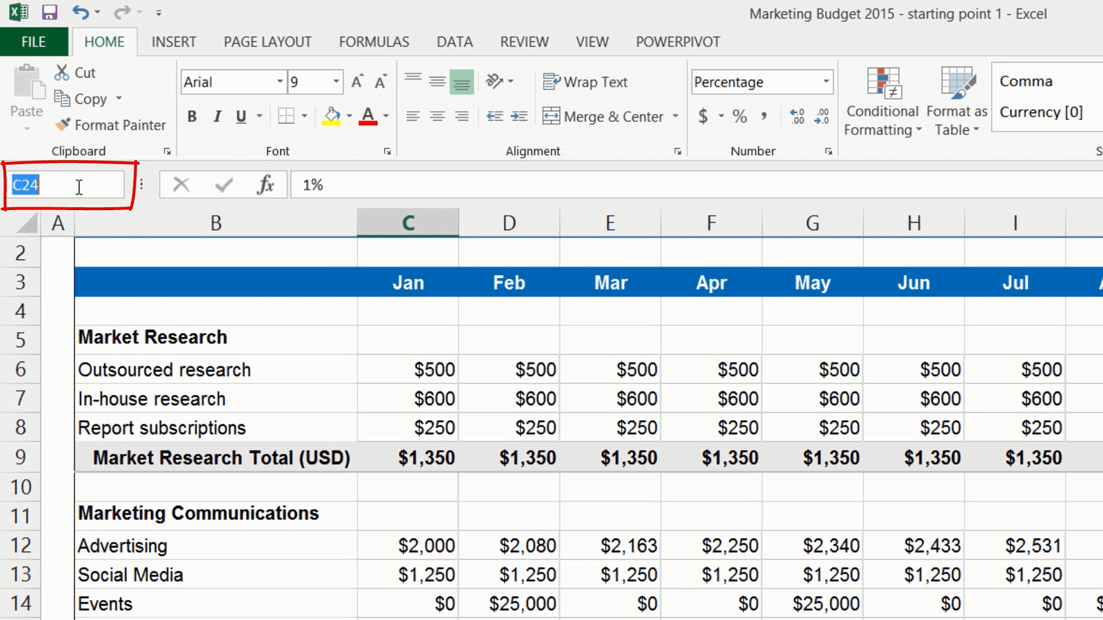
Here I have a simple template for a marketing budget for 2015 that I need to fill out. My template doesn’t have the months so I’ll add them to the third row. You can save time by letting Excel automatically fill the cells for you. To use autofill, start writing the first cell, here I’ll write “Jan”. To continue filling in the rest of the months, position your mouse pointer in the bottom right corner of the cell and drag the fill handle to the right. You can use autofill for time series like months, days and quarter, but you can also use it for numbers and other sequences. A little autofill icon appears where you can choose if you want to copy cells or fill the series. I am happy with this so I will just move on.
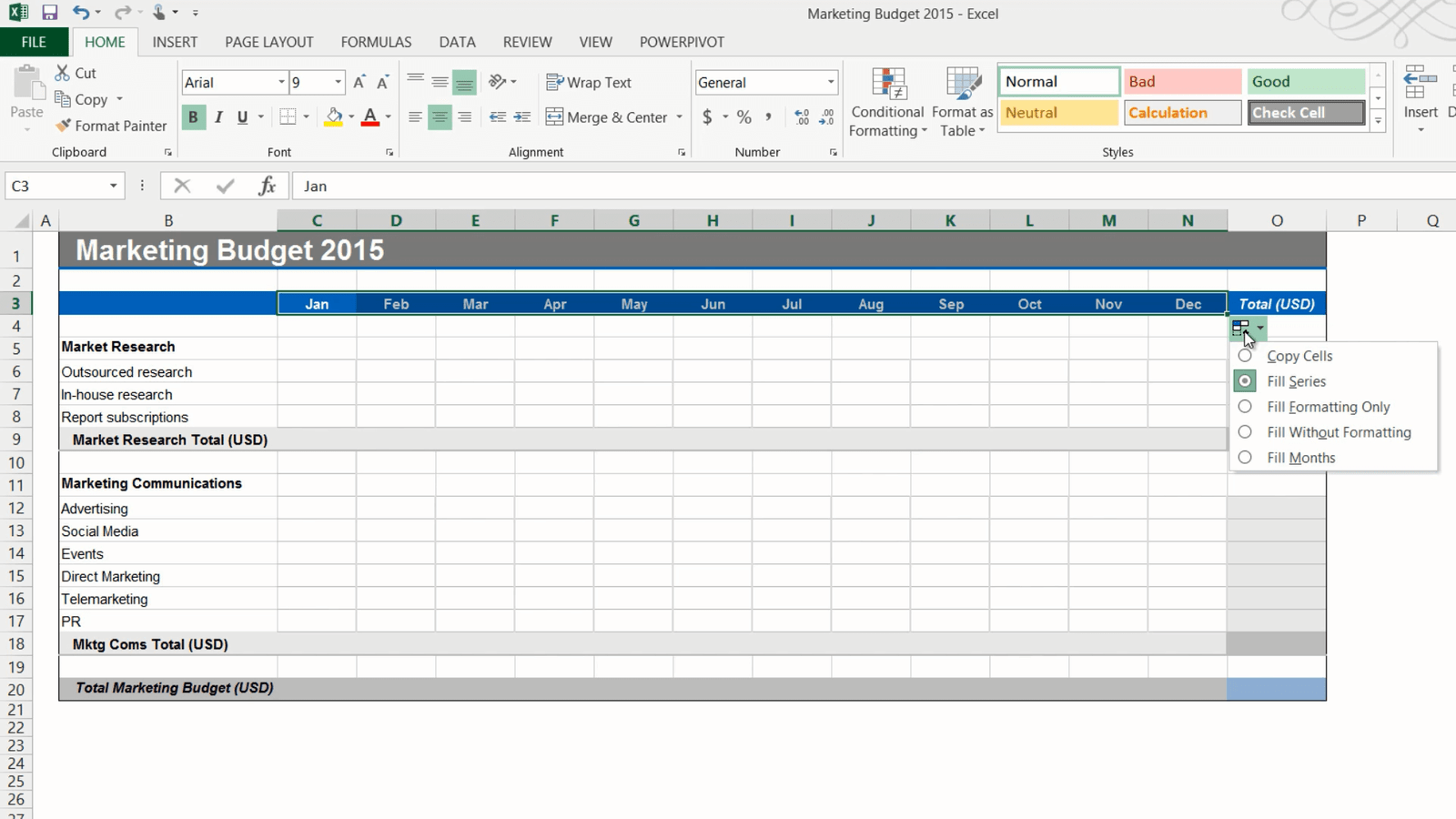
Now I’ll add the first budget item which is “Outsourced research”. We pay a fixed cost of 500 dollars a month for this so I’ll write 500 in the first cell and then copy the number across all months by dragging the fill handle. Again I can change the autofill options in the drop down if I wanted to.
Using a formula to apply a 20% increase (01:34)
The next item, the “In-house research” is 20 percent more expensive than the outsourced market research so I’ll create a formula to calculate that number. To insert a formula, mark the cell and write an equal sign, this is the way you start all formulas in Excel, then I’ll mark the “Outsourced research” number and multiply it with 1.2 to get the 20 percent increase and press “Enter” to see the result.
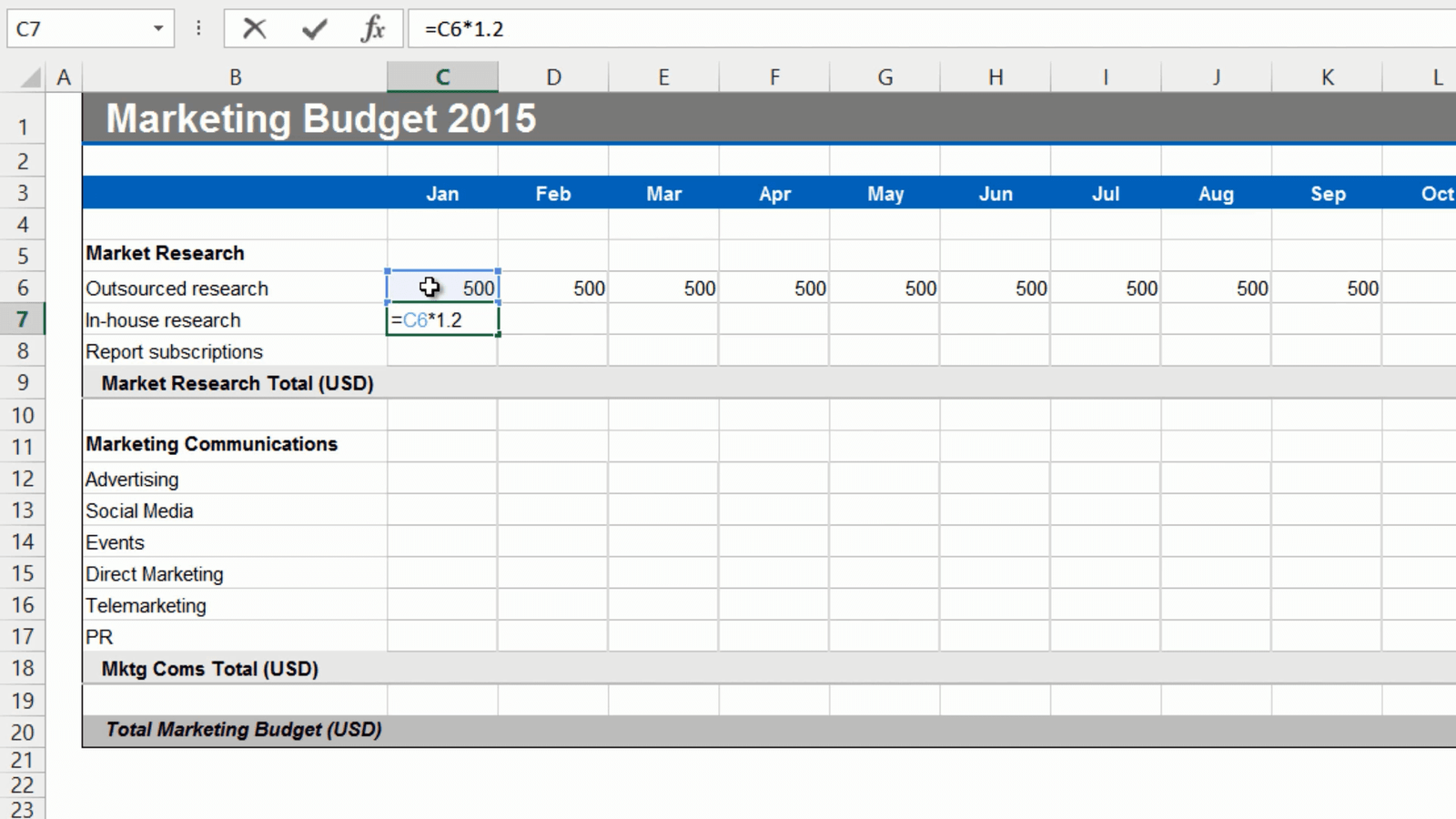
There, that looks fine, so now I’ll grab the fill handle and drag it across all columns to copy the formula. If you double-click one of the cells you can see that the formula takes the value above and multiplies it with 1.2. This is a so called relative reference, meaning that the formula is updated to reflect its location in the spreadsheet.
Filling multiple cells at once with the same value (02:25)
Next I want to fill out the “Report subscription” row. This is a fixed cost of 250 dollars each month. Instead of entering the number in the first cell and using autofill, you can mark all the cells where you want the value, write the number, here I will write 250 and press “CTRL + Enter”.
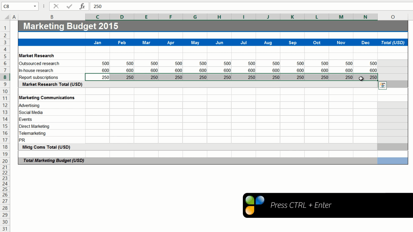
All the cells are filled at once.
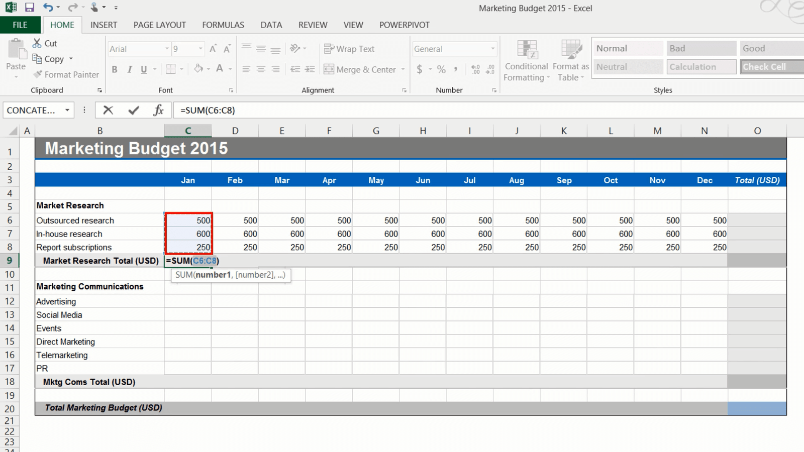
Using “AutoSum” to calculate totals (02:46)
Now I want to add totals for this section. Since adding up numbers is done very frequently in Excel, there is a button for it called “Autosum”. To use Autosum, mark the cell where you want the total on the “HOME” tab, in the “Editing” section click the “AutoSum” icon with the Greek symbol Sigma (S).
Autosum will automatically select all numbers in the adjacent data range. In this case cells C6 to C8. Press “Enter” to see the result. To get the totals for the rest of the months, you can copy the Autosum formula by dragging the fill handle to the right. To use Autosum for the row totals, position the marker in the first row total and click “AutoSum”. As you can see the data range to the left is selected and summarized.
If you have numbers in a data range like this and you want to add totals for both rows and columns, you can save time by marking the entire data range, including the empty cells where you want to have the totals, and clicking “AutoSum”. All the totals you need are added in a split second.
Using formulas with fixed, “absolute” references (03:54)
In the next section the first line item is “Advertising”. I want to incrementally increase the advertising with a certain percentage each month. I’ll start with 2000 dollars in January. I’ll mark the year total and click “Autosum”. Now I want to test some different percentage increases to see what the total cost will be for the year. Under my budget I’ll write, “Advertising monthly increase” and just start out with a percentage, let’s try 5%.
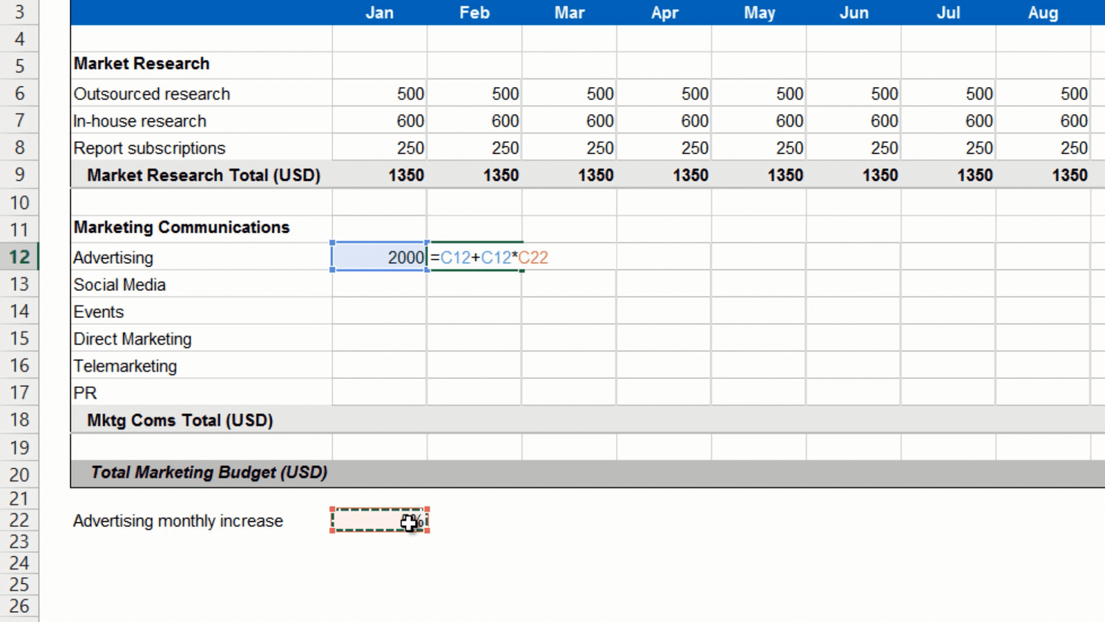
I’ll mark the cell next to the first month’s spend and write the formula, equal sign, previous month, plus previous month times the percentage increase and press enter to see the result.
If you want to copy this formula, that includes the reference to the percentage in cell C22 to other cells, you need to use an absolute reference. If you don’t, and try to copy this formula across the rows you won’t get the right results. If you double-click the formula you can see that the formula is using the value in the cells one step to the right, so it’s not picking up the 5 percent increase. To get the right result you need to change the formula so that it uses an absolute reference for the percentage increase. Double-click the cell with the formula, position your marker on the cell reference for the percentage increase, in this case it is Cell C22. To make this an absolute reference add a dollar sign before the column letter and row number to keep it fixed. The easiest way to do that is to press “F4” on your keyboard and then press “Enter”. Now you can apply the formula to the entire row and you will get the correct result.

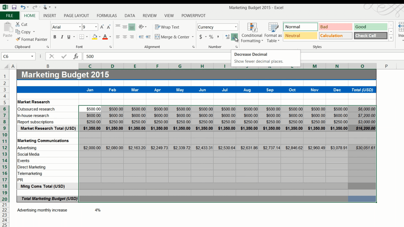
As you can see the total is much more than 30,000 which is more than I want to spend but now I can easily just change the percentage to say 4 percent. The total is now slightly higher than 30,000, but that’s ok, I’ll leave it like that.
Changing the number format (05:49)
Now I got a lot of decimals that I don’t need. First I’ll change the number format to currency, to do that, mark the cells where you have the numbers, on the “HOME” tab in the “Number” section I’ll select “Currency”. I’ll leave the default which is US dollars. Then I’ll reduce the number of decimals by clicking “Decrease Decimal” in the “Number” section. This doesn’t delete the decimals it just hides them.
Removing formulas and keeping the values (06:14)
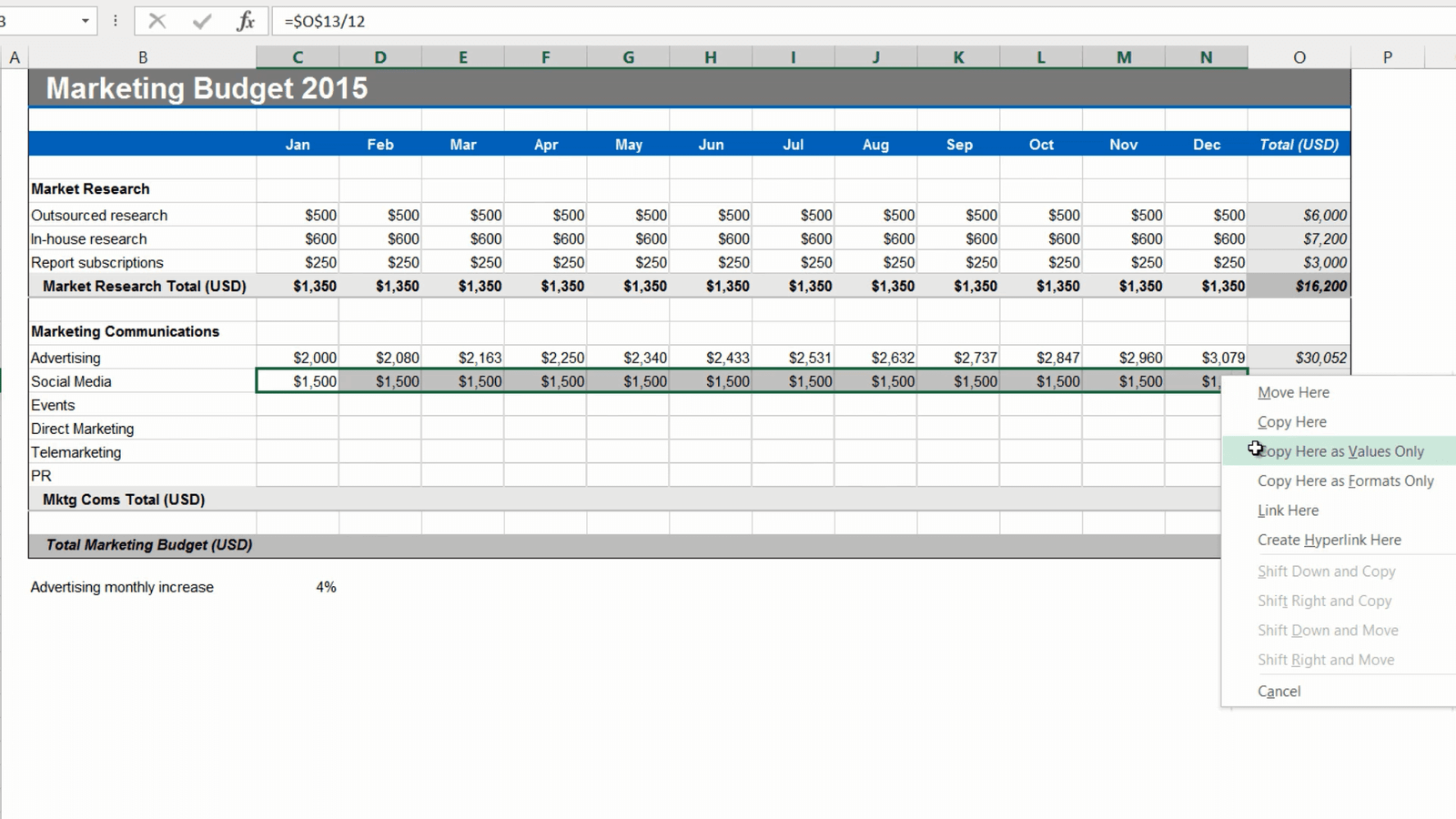
Next is “Social Media”. I want to spend 15,000-20,000 dollars on an annual basis distributed evenly throughout the year. I’ll start by entering 15,000 in the total cell and then in the cell for January I’ll write the formula, equal sign, mark the total and I want to make this absolute so I’ll click F4, and then divided by 12 for the 12 months.
If you hold down “CTRL” when you press “Enter” you’ll stay in the current cell. Now I’ll apply this formula to the rest of the months.
The monthly spend is 1250, I want to increase it a bit so I’ll change the year total to 18000. Now the monthly spend is 1500 which is better.
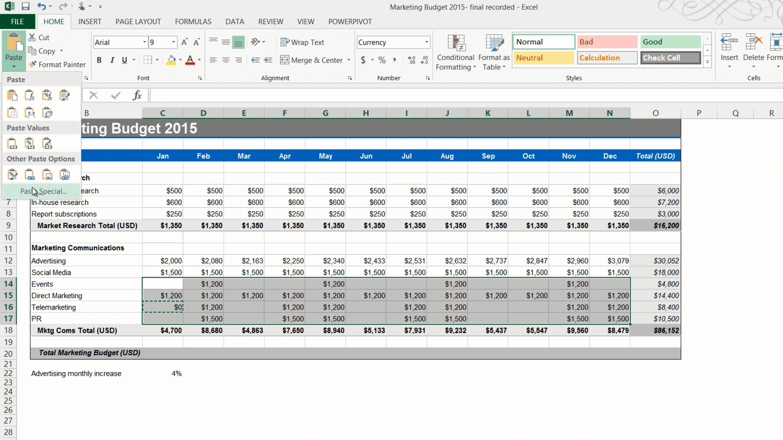
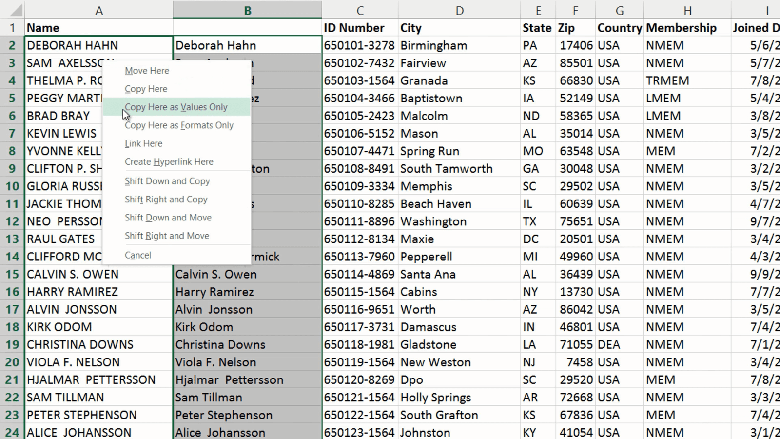
Now I need to remove the formula and only keep the values, otherwise if I later on manually change the value of a cell the total won’t update. To remove the formulas and only keep the values of these cells I’ll mark the numbers, right click, drag a little back and forth and then select to “Copy here as values only”.
If I double click you can see that the formula is gone, and only the values remain. I will go to the Total cell and remove the fixed value. Here I’ll use the keyboard shortcut for “AutoSum” which is “ALT + =”. And now, as you can see, if I make changes here in the cell the total is calculated correctly.
Selecting and filling random cells with a value (07:40)
On the next row I have “Events”. We plan to have our events quarterly. To fill multiple cells with the same value, hold down the “CTRL” key while marking the cells you want to fill. Here I’ll mark the cell for February and then mark a cell each quarter. Release “CTRL” and enter the amount you want to fill the cells with. Here I’ll write 1200. Press “CTRL” again and press “Enter”. All the cells that were marked are filled with the value.

Now I’ll continue to fill out the remaining line items.
Adding a “0” to empty cells (08:13)
Now I’m almost done with my budget, I just want to add zeros to the remaining empty cells. Instead of manually filling out these cells, you can use a little work-around.
To fill multiple, random cells with zero, type 0 in one of the empty cells. Right-click and copy. Then mark the entire data range with empty cells that you want to fill, click paste and select “Paste Special”. Under “Operation” click “Add” and then “OK”. There, now zero has been added to all cells.
Now for the final row. Here I’ll enter a formula that add the first subtotal for “Market research” with the second subtotal for “Marketing Communications”. I’ll copy the formula across and select “Fill without formatting” since I only want to copy the formula. Finally I’ll hide the row with the advertising increase by right clicking and selecting “Hide”. There now I’m done with my budget!
Closing (09:11)
As you can see, by knowing how to use simple formulas and some of the shortcuts I showed you here, you’ll save a lot of time when filling out your spreadsheets.
Sort and filter data to find answers
Introduction (00:04)
Quite often you have a spreadsheet with data that you need to make sense of. In this video you’ll learn how to sort and filter data to find answers to specific questions. You’ll learn how to sort data on multiple columns, how to sort on color and how to filter data based on different data types. Let me show you!
Checking for empty rows or columns (00:26)
Here I have a spreadsheet with data exported from our customer relationship system. Each row represents a sales opportunity. To sort data you first need to make sure that you have no gaps in your datasheet – that is, no empty columns or empty rows.
If you do have gaps, like I do here and you sort your data, Excel will only sort the data up to that gap and you will be left with inconsistent data.
![]()
One way to check your data for empty columns or rows is to go to the end of the data range. To go the end of the data range horizontally, double click the right side of any cell in a row, or press the keyboard shortcut CTRL Arrow Right. Here I seem to have an empty column, but to make absolutely sure there is no data further down in the column I’ll press CTRL Arrow Down. Since this takes me to the very last cell of the spreadsheet I can be sure that this column is empty. I’ll press CTRL Arrow Up and then I’ll right-click and delete the column. To check for empty rows follow the same procedure downwards.
Sorting data by a single column (01:39)
Now I’d like to know how large our biggest deals are in terms of revenue. To sort your data, mark any cell in the column you want to sort by, here I’ll mark a cell in the “Product revenue” column. Click the “DATA” tab and in the “Sort & Filter” section select how you want to sort your data. In this case I want to see the largest numbers at the top so I’ll select the sort button named “ZA” which sorts largest to smallest.
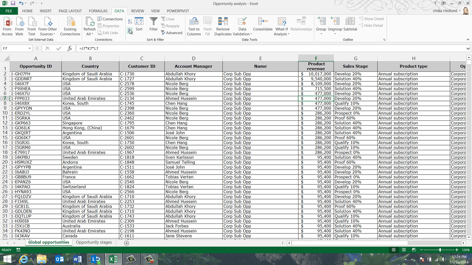
Immediately, I can see the largest numbers at the top. Now I get a much better understanding of this opportunity pipeline.
Sorting multiple columns after one another (02:16)
Now I’d like to know how many opportunities each account manager has and what type of opportunities these are, so I want to sort by two columns. To sort data by multiple columns, on the “DATA” tab, in the “Sort & Filter” section click the “Sort” button. Here you get the option to add multiple levels. First remove any previous sorting criteria by clicking “Delete Level” and then click “Add Level”.
In the “Sort by” drop down select the first column you want to sort by, I’ll select the “Account Manager” column. Then select what you want to sort and in what order. I’ll keep the default which is “Values” and “A to Z”. To add another sorting level click “Add Level” and select the second column. Here I’ll select “Opportunity Type”. Again I’ll leave the default, “Values” and “A to Z”. To apply the filter click “OK”.
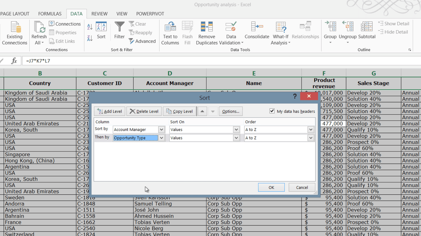
And now the data is sorted by these two columns. Here I can see that our account manager Abdullah has three consulting opportunities and the rest subscription opportunities.
Sorting in an order you define yourself (03:27)
Now I’d like to sort the data by “Sales Stage” to understand how many opportunities we are about to close. The “Sales Stage” column can contain one of the following values. I can’t sort this column alphabetically, because then I’ll get them in the wrong order, so I’ll have to sort them in a custom order that I define myself.
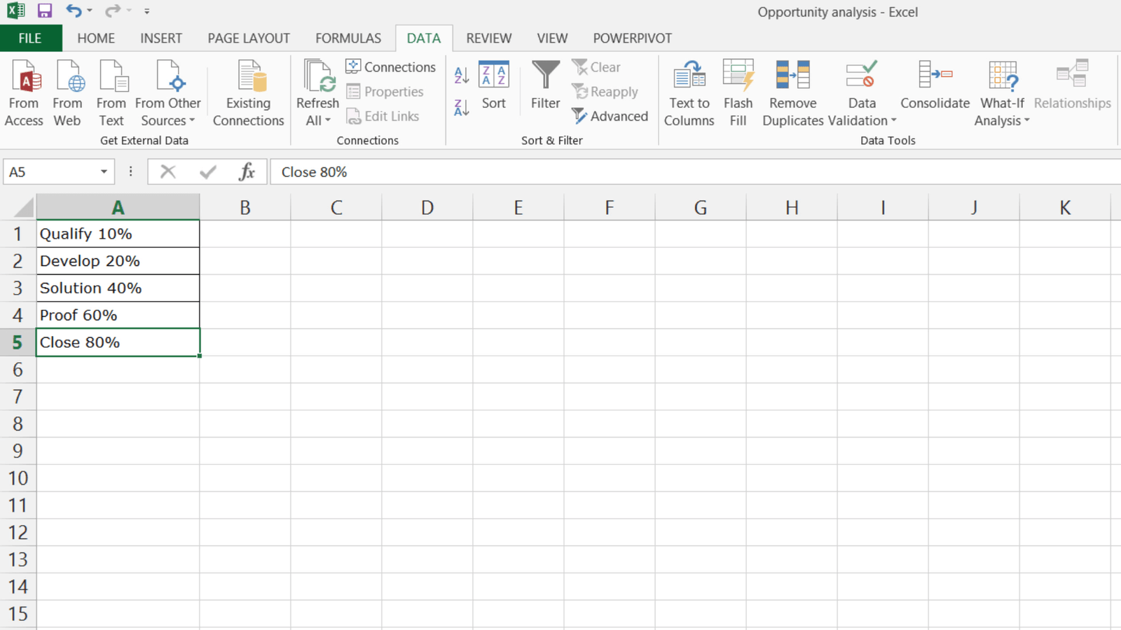
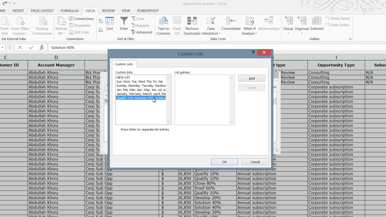
To sort data in a custom order, click the “Sort” button. Here I’ll delete any previous columns I’ve sorted by. Click “Add Level” and select the column you want to sort by. Here I’ll select the “Sales Stage” column. In the “Order” drop down select “Custom List”. Here Excel has a number of custom lists built in, so for instance you can sort data by day of the week or month of the year and so on. Here I’ll select “NEW LIST” and click “Add”. Now I can add my sales stages by typing them in and Excel will use this as the sorting order.
Another quicker way to do this is to click the “FILE” tab and then “Options”. Click “Advanced” and scroll all the way down until you see “Edit Custom Lists”.
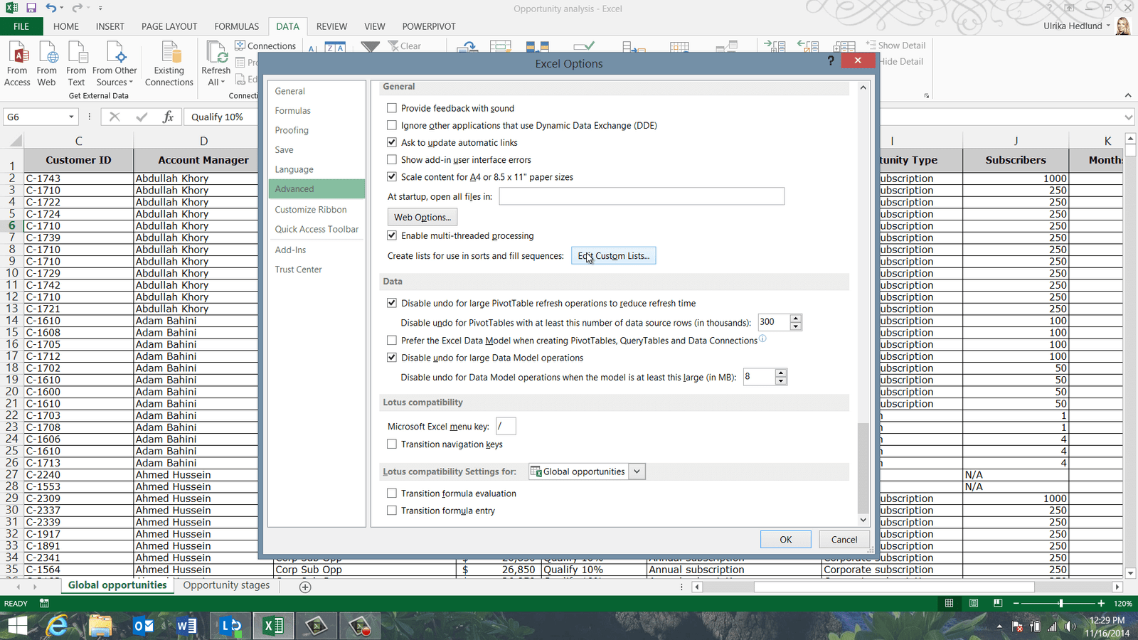
Click the selection button and mark the list with your defined sort order and then click “Import”. As you can see, the list has now been added to the custom list of Excel.
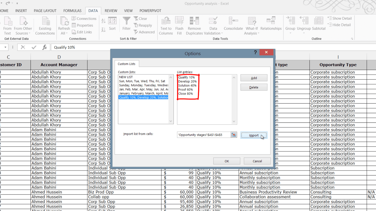
Click “OK”, and then “OK” to close down the “Options” window. Click the “Sort” dialog box again and click “Add Level”. Select the column you want to sort by. In the “Order” drop down select “Custom List”, and as you can see, the list that you just imported is now available as an option.
Select it and click “OK”. Now you can see that the data has been sorted by “Sales Stage”.
Sort data by formatting such as color (05:20)
In addition to sorting on the values of cells, sometimes you want to sort by formatting, such as the color. Here you can see that I have a number of rows that have been highlighted with a different cell color. To sort data by formatting, mark a cell with the formatting applied, right-click and select “Sort”, Here I’ll select “Put Selected Cell Color on Top” since I want to sort on the cell color.
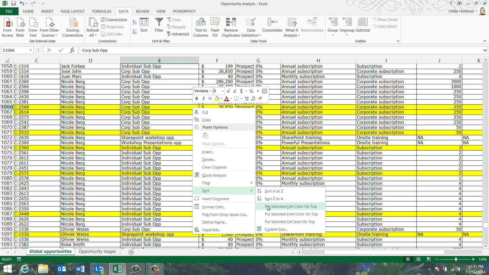
All yellow rows are now sorted on top. If you don’t want to scroll to find all colors, on the “DATA” tab, click the “Sort” button. Click “Add Level” here you can select any column since they are all colored, in the “Sort On” drop down select “Cell Color”. In the “Order” drop down you can see all the colors that are present in your spreadsheet. Here I’ll add the green color and click “OK”.
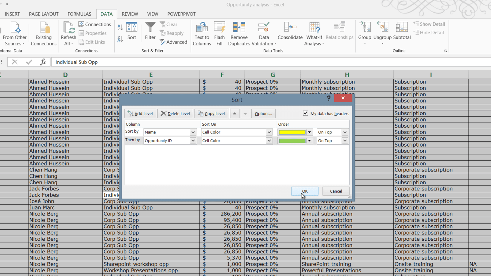
Now I have all the opportunities that have been highlighted in yellow at the top followed by the opportunities in green. I can quickly see that the ones that have been highlighted in green have been closed in just about ten days, whereas the ones that have been highlighted in yellow are still on the Prospect stage, even though they’re over 150 days old.
Sorting randomly (06:38)
Sometimes you want to sort data randomly. Say for instance that you randomly want to pick 10 opportunities to follow up on. To randomly sort your data you can use a function that Excel provides to generate random numbers. Mark the first data cell in the column next to your data range, write equal mark and then the function “RAND()”.
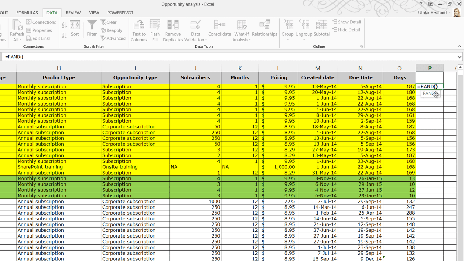
A random number between zero and one is automatically generated. Double-click the bottom right cell corner to generate numbers for all rows. To sort by this column, mark any cell in the column and on the “DATA” tab click sort “A to Z”. As you can see, the data has now been sorted completely randomly. Now you can right click and delete this column.
Filtering your data (07:27)
In addition to sorting, you can find answers by using filters. To filter your data mark any cell in your data range, on the “DATA” tab, in the “Sort & Filter” section click the “Filter” button. As you can see you get a little arrow next to each column name. Click on the arrow to see the various filter options. You can resize the filter window by just pulling the handle. Here you can deselect all values by un-checking “Select All” and then select what you want to filter on and click “OK”.
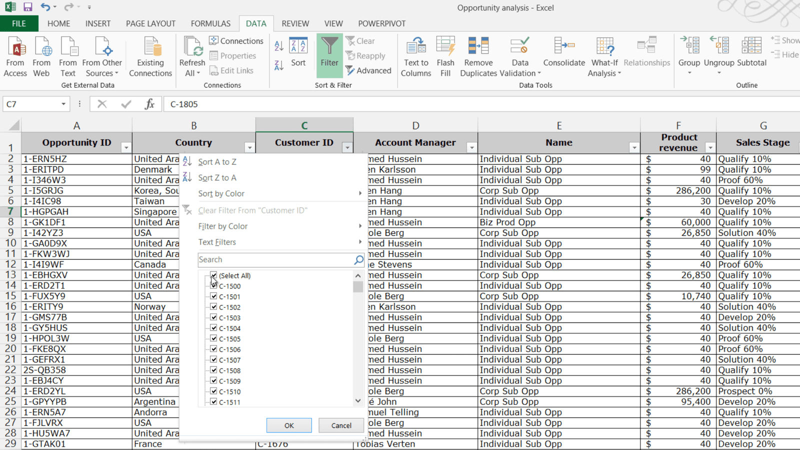
To clear the filter again click “Clear” on the “DATA” tab or click the column filter and select “Clear Filter from” the Column name.
![]()
Depending on the type of data in the column, Excel provides you with different filers. Since this is a text field I get “Text Filters”. The “Text Filters” enable you to filter on fields containing specific characters. In Excel 2010 Microsoft introduced a new powerful search filter. Say for instance that I want to see all opportunities from the customers with customer ID 1610 and 2398. I’ll type in 1610 in the search field and click “OK” to see all opportunities related to that customer ID.
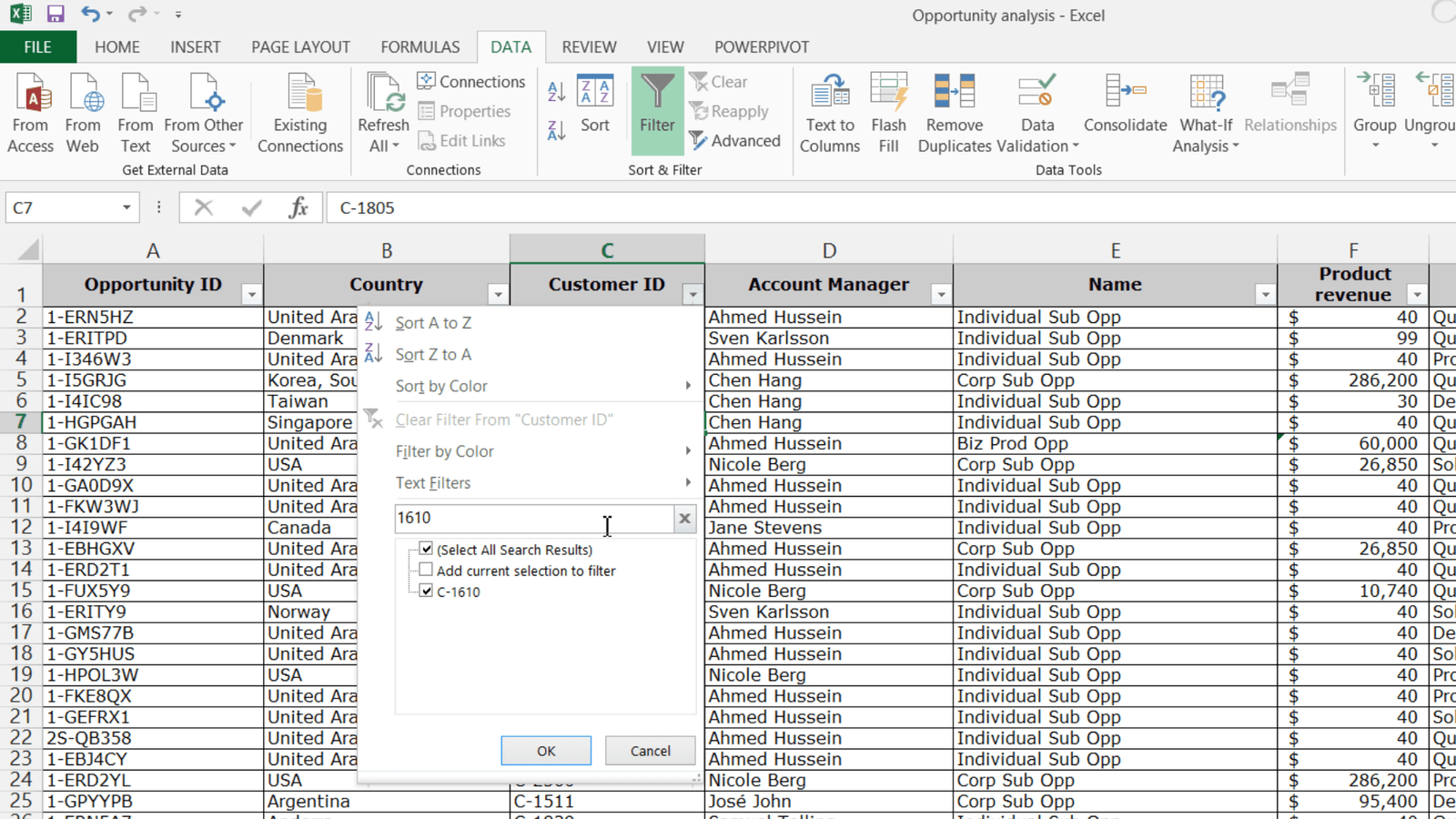
I’ll click “Filter” again and write in 2398. To keep the initial results I’ll mark the option to “Add current selection to filter”. Now if I click “OK”, I get both customer IDs. If I go to the “Product revenue” filter, you can see that I here have “Number Filters”. Here I want to find our top 10 deals so I’ll click Top 10 items and click “OK”.
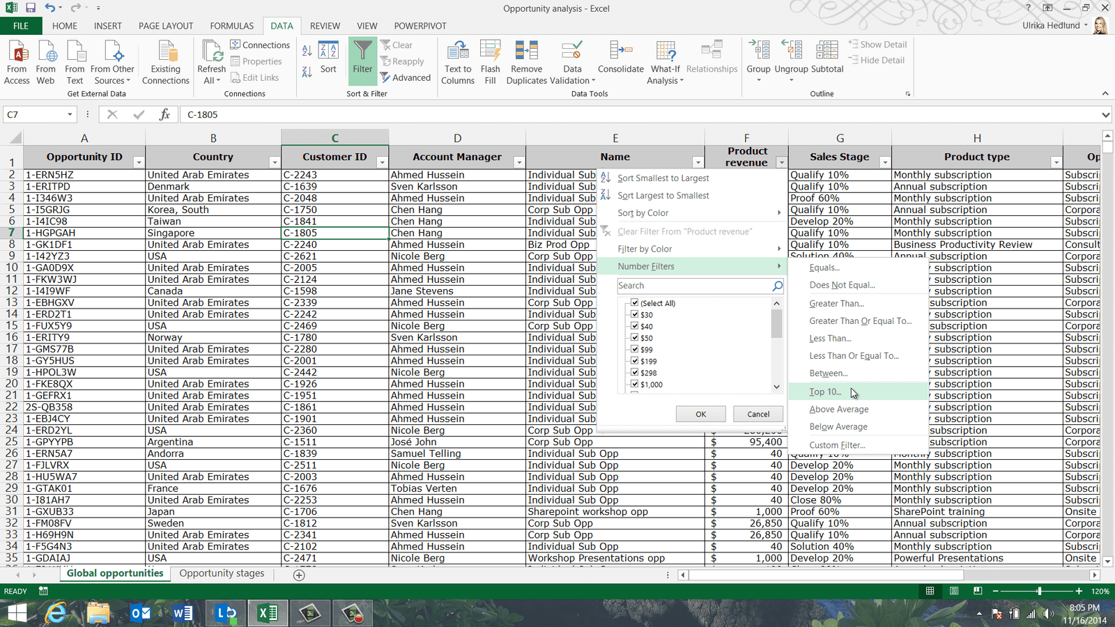
Now I can see the top ten opportunities based on “Product revenue”.
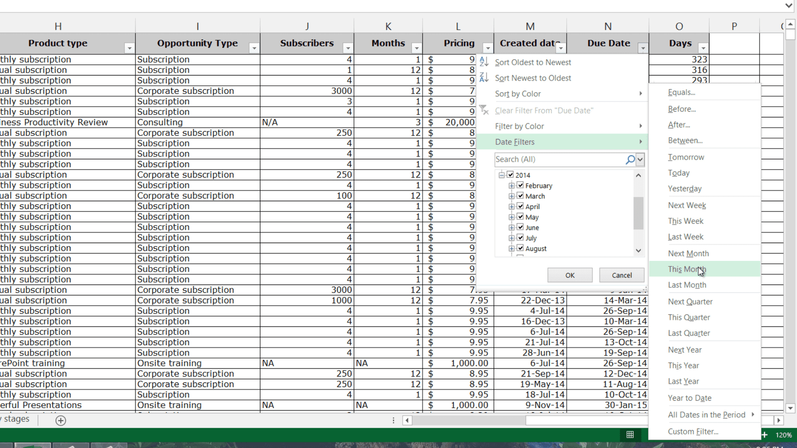
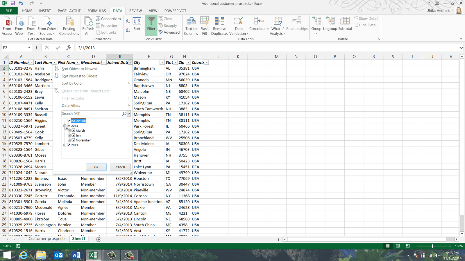
Finally let’s have a look at a date filter. Here I’ll filter the “Due date” column. As you can see the filter options are neatly organized in years and months. Excel provides me with a number of “Date Filters”. Here I’ll filter “This Month” to see only the opportunities that are due this month.
Closing (09:46)
Now that you know how to effectively sort and filter data, you’ll easily be able to find answers hidden in large data sets.
Rearrange and clean up your data
Introduction (00:04)
From time to time you need to re-arrange data and clean it up in your spreadsheet in order to display it the way that you want it. In this video you will learn how to re-arrange rows and columns, how to spot and remove duplicates and how to change data types for easier analysis. Let me show you!
Changing column and row width (00:24)
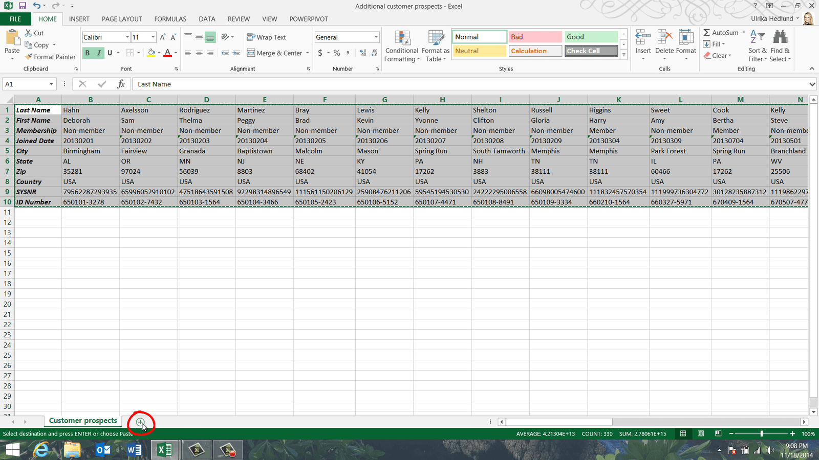
Here I have a spreadsheet with customer prospects that we are going to share with an agency for follow up. I’ve been given another spreadsheet with additional prospects that I need to add to my list. But the data in this additional spreadsheet is arranged differently and there might be duplicates so I need to clean up the data before I can consolidate the lists.
The data in the second spreadsheet is very compressed. Here is a row that only seems to contain hash tag symbols.
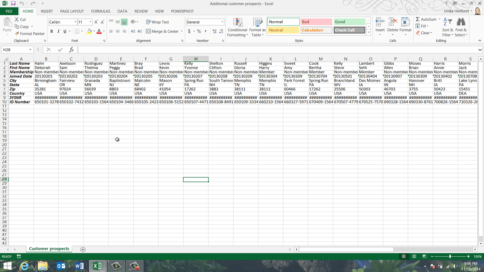
This is Excel’s way of telling you that the cell is too small to display the full contents. You can make the column wider by dragging the column edge to the right to see the full contents.
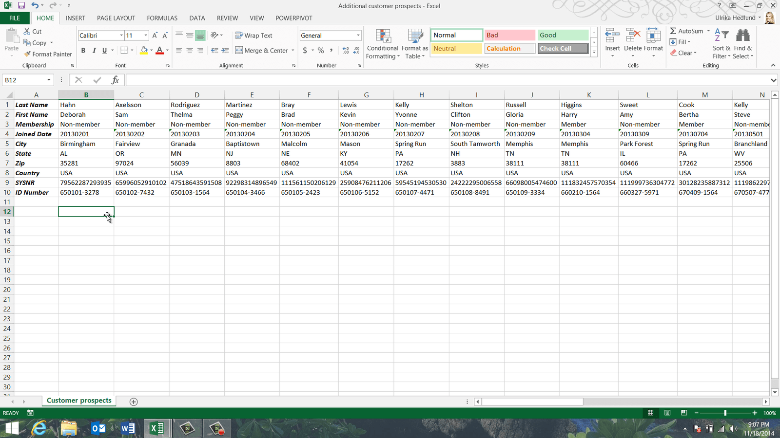
Instead of resizing individual columns you can resize all columns and rows at the same time. To change the width of all columns, mark the entire spreadsheet and then make any column wider, all columns will then have the same width. You can also double click between two columns to automatically make the columns as wide as they need to be to properly show the contents. You can do the same for the rows by double-clicking between two rows. As you can see the entire spreadsheet is now much easier to read.
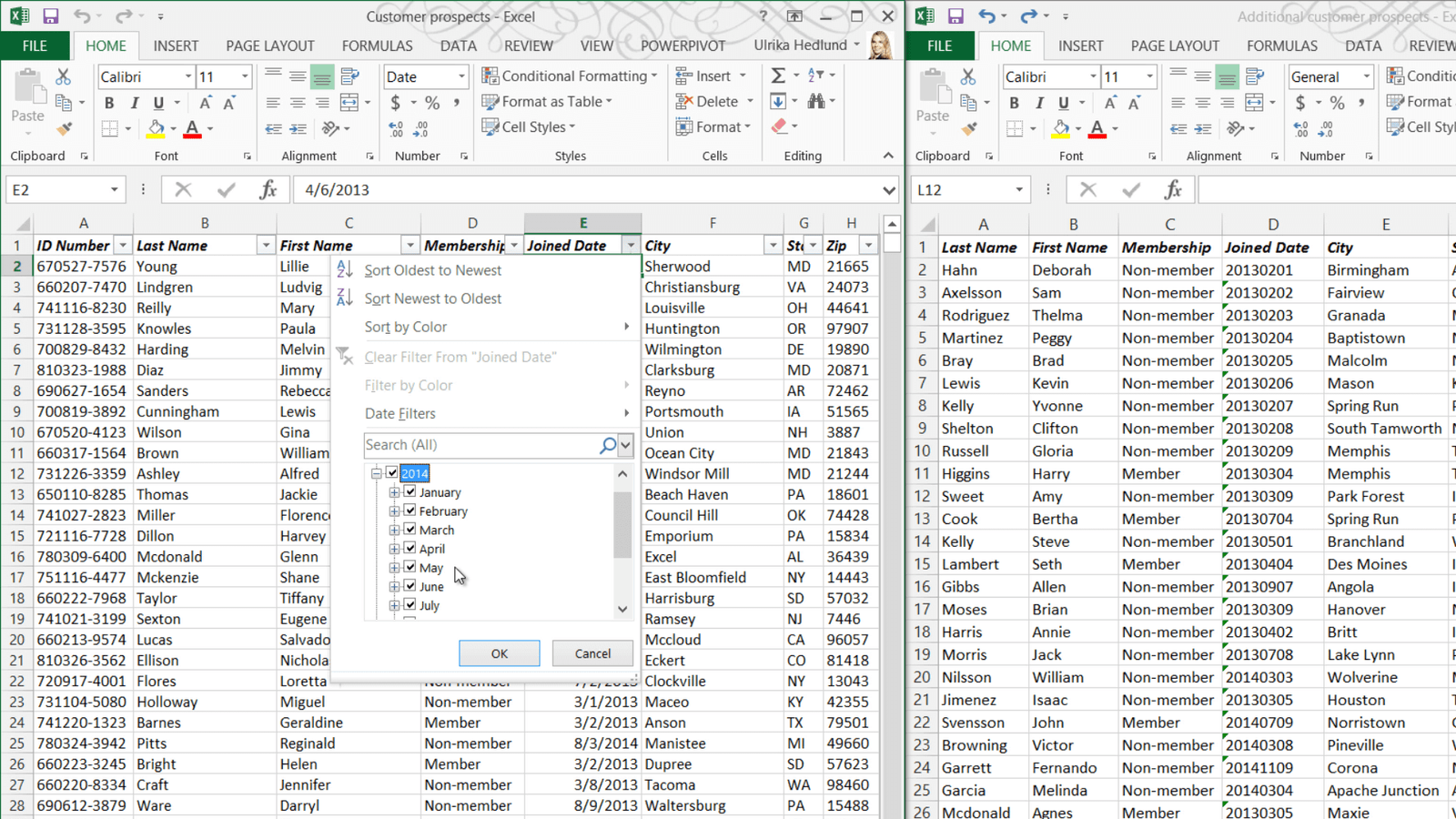
Turning data from row to column (transposing data) (01:44)
Now I can see that the layout of this data is different than in my original list. To append this list to mine I first need to convert the rows into columns –that is transpose the data. To transpose data, first mark the entire data range by marking the first cell and then pressing the keyboard shortcut CTRL Shift End. Right-click and select “Copy”. I’ll open up a new worksheet by clicking the plus sign at the bottom of the spreadsheet.
To re-arrange the data from row to column layout, right-click and under “Paste Options” select “Transpose”. The data is copied and turned from column to row.
![]()
Comparing spreadsheets side by side (02:30)
Again, to change the width of the columns I mark the spreadsheets and double click. Before I copy data to the other spreadsheet I need to make sure that the spreadsheets contain the same columns and that they are in the same order. To compare the spreadsheets side by side I’ll press the keyboard shortcut Windows key Arrow Right to move this windows to the right, then I’ll mark my other spreadsheet. Instead of using the keyboard shortcut I can use the mouse and drag the window to the left side of the screen. Here I can see that my initial list doesn’t contain the column named “System Number”, my original list also has the ID number as the very first column.
In my original spreadsheet the contents of the “Joined Date” column is stored as dates. This means that I can easily filter the list by “Joined Date”.
In the second spreadsheet the data is stored as “Text”. If I go to the “DATA” tab and select “Filter” and look at the “Joined Date” column you can see that I just get a long list of numbers, Excel doesn’t treat the data here as dates.

I’ll cancel here and remove the filter from my list. To make the necessary fixes to this spreadsheet I’ll maximize the window again by clicking “Maximize” in the top right corner.
Deleting and moving columns (03:58)
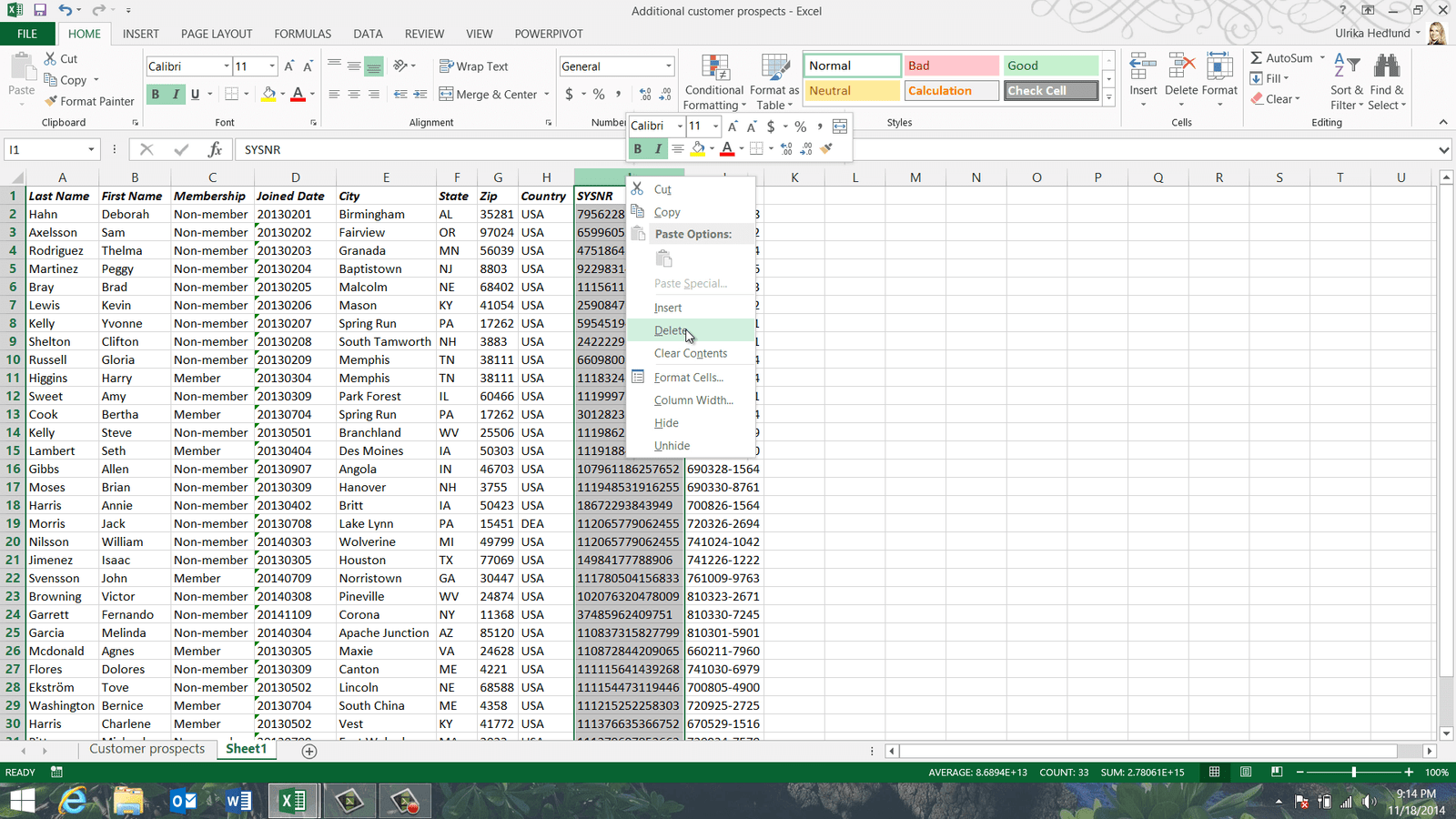
To delete a column, right-click the column heading letter and select “Delete”.
To move a column, mark the column by left-clicking the column letter, move your mouse cursor to either side of the column until you see a cross, hold down the right mouse button and drag the column to the desired position, release the mouse button and from the menu select “Shift Right and Move”.
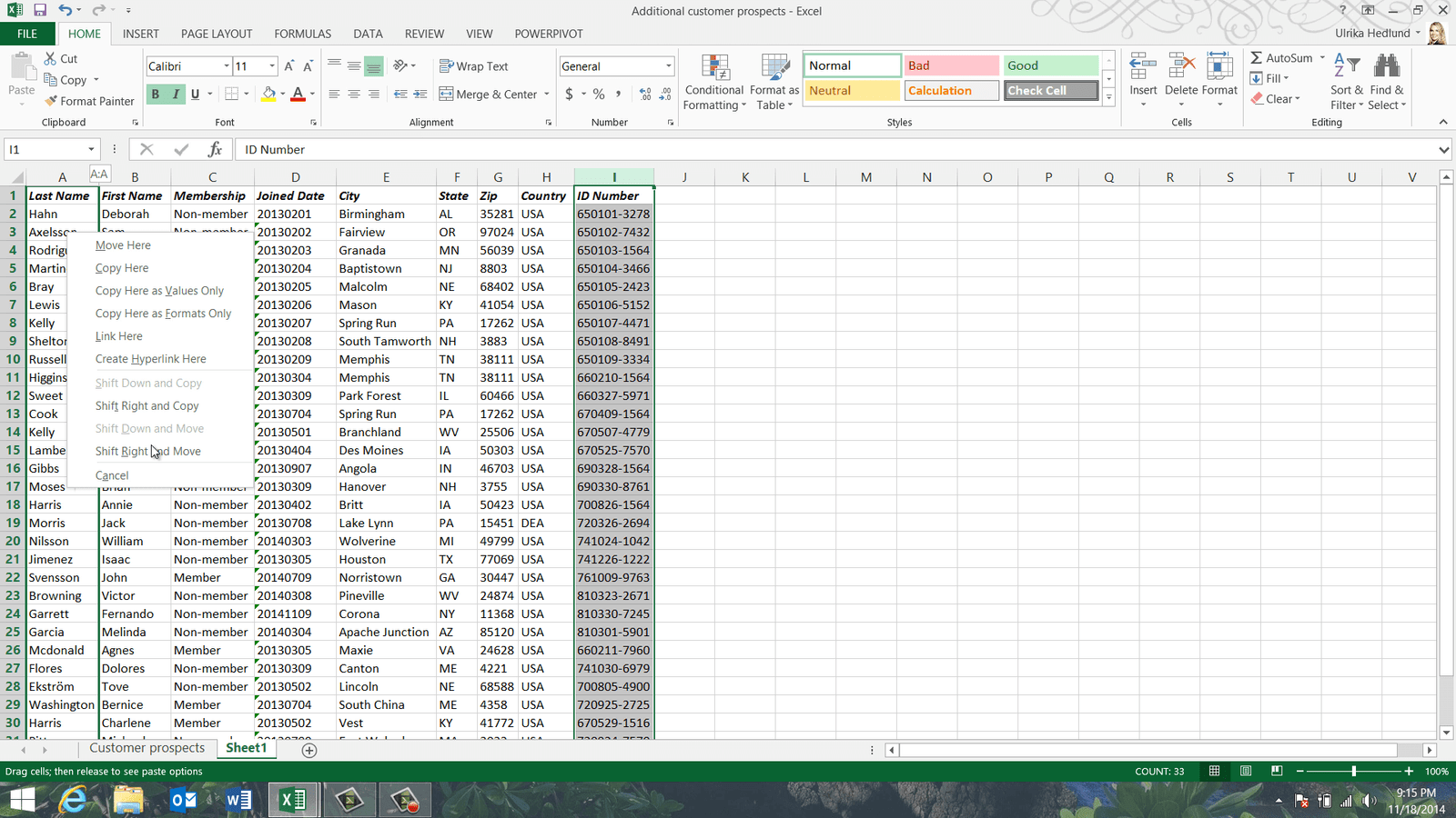
The columns are shifted to the right to make room for the ID Number column.
Changing column data type (04:32)
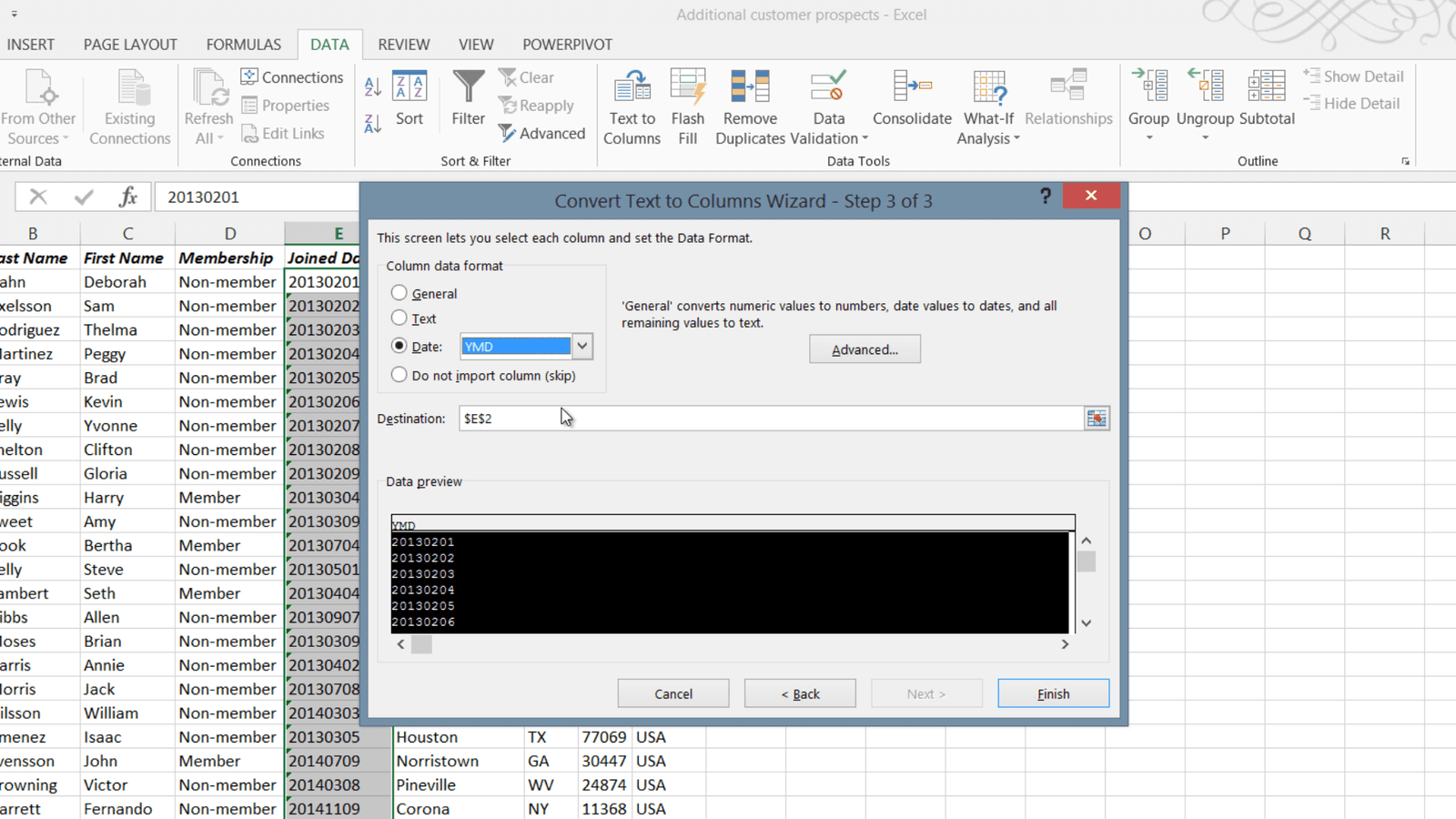
To convert the data type of the “Joined Date” column from Text to Date mark all cells that contain the text string by marking the first cell and then pressing CTRL SHIFT Arrow Down on your keyboard. Click the “DATA” tab and then in the “Data Tools” section click “Text to Columns”. A wizard opens up that steps you through the process. In the first step you are asked about delimiters. You don’t have to change anything here so click “Next” to go to the next step.

In the second step uncheck all delimiters, since the text string is all in a single string. In the third step of the wizard you have the option to set the data format. Select “Date” and specify the format as Year, Month and Day (YMD) since this is the way the text string is written and then click “Finish”.
As you can see the format of the “Joined Date” column has now been changed and if I click on the “Filter” button I can select to filter this column on a specific year or month.
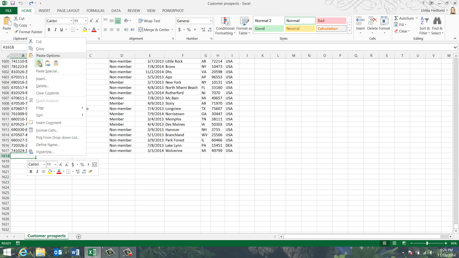
Now I can copy the data over to my original spreadsheet. Before I do, lets save the changes to my spreadsheet. To copy the full data range I’ll mark the first cell under the heading row and press CTRL Shift End on my keyboard. I’ll right-click and select “Copy”, next I’ll open up my original spreadsheet and go to the very end by pressing CTRL End. I’ll mark the first empty cell under my list, right-click and select “Paste”.
To go back to the top again I’ll press CTRL Home. Now I have all data consolidated in one spreadsheet. Now I just have to make sure I don’t have any duplicates.
Spotting and highlighting duplicates (06:23)
To easier spot duplicates start by sorting your data on unique values. In this list two people might have the same first and last name, but the “ID Number” for everyone is unique. To sort on the “ID Number” column I’ll mark a cell in this column, click the “DATA” tab and then sort A to Z.
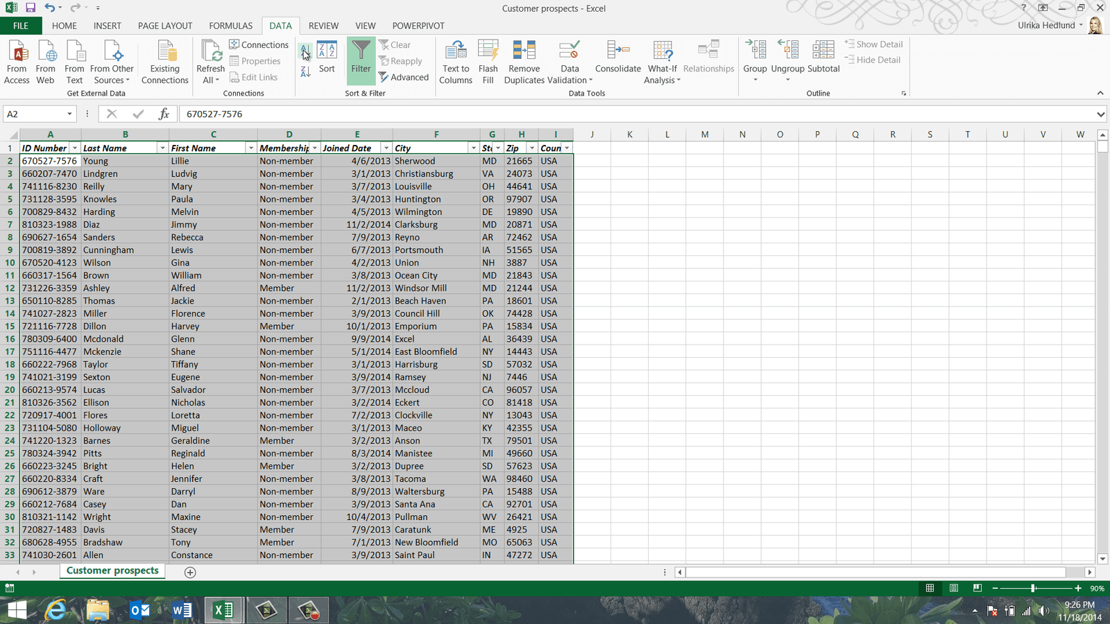
I can immediately see from just looking at the data that I do have duplicates. To make duplicates stand out even more you can highlight them using conditional formatting. Mark the column where you want to highlight duplicates, in my case it is the first column with the “ID Number”. On the “HOME” tab, click “Conditional formatting” and select “Highlight Cells Rules”, and then “Duplicate Values”.
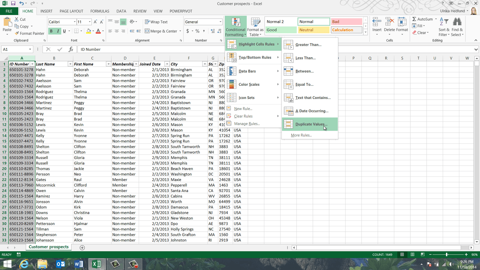
Here you can select how you want the duplicates to be formatted, I’ll just leave the default coloring which is light red fill with a dark red text.
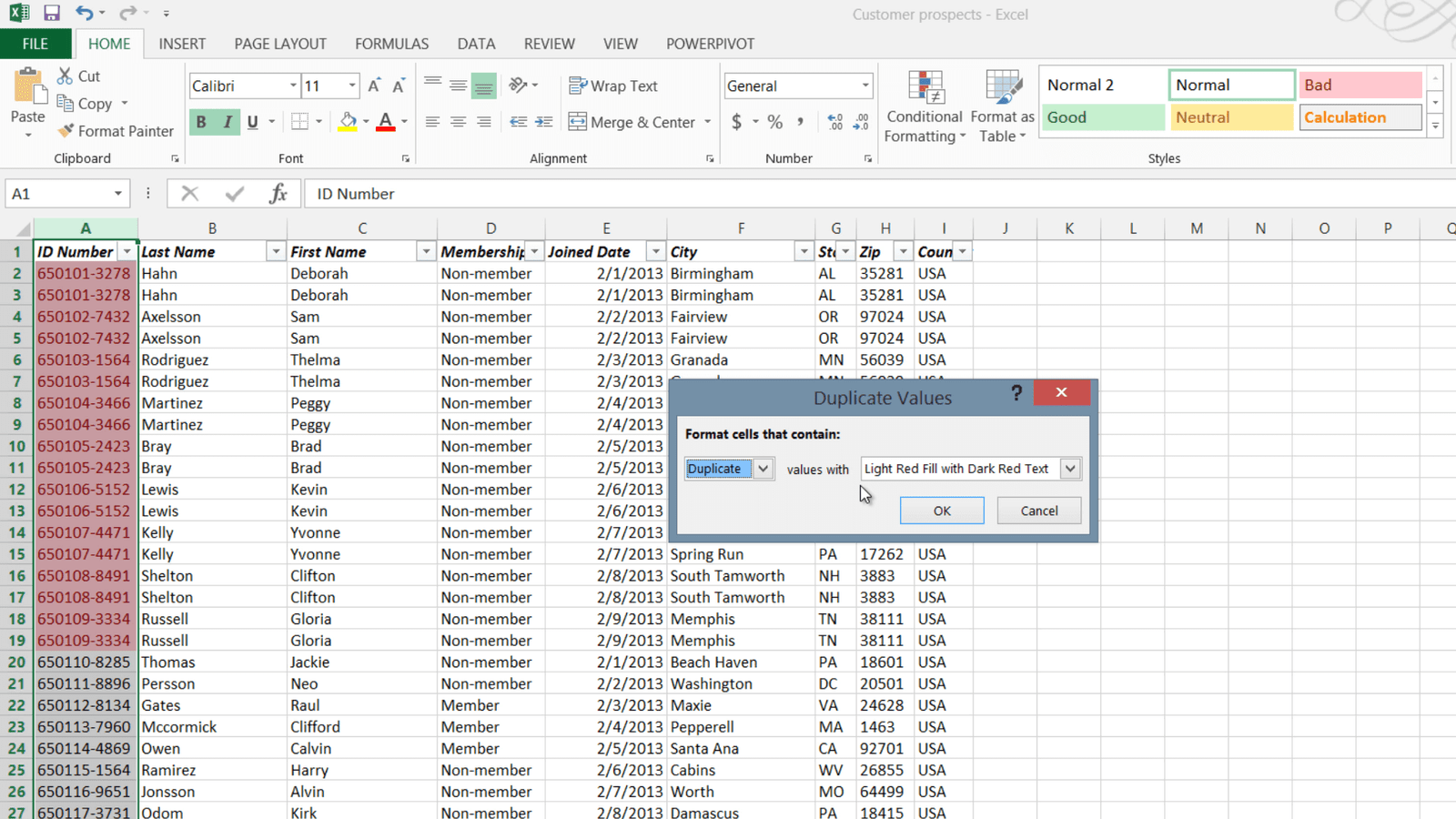
I’ll click “OK” and now the duplicates in my dataset are clearly visible. If I scroll down I can see that I have even more duplicates further down in the list. To see all duplicates at the top you can sort by color. Click the “DATA” tab, and in the “Sort & Filter” section click the “Sort” button. Instead of sorting the “ID Number” column by “Values, I’ll change the “Sort On” drop down to “Cell Color”, in the “Order” drop down I’ll select the red color and then leave the default which is “On Top”.
Now all duplicate records are sorted on the top. I’ll mark all colored cells and can see in the bottom of my spreadsheet that the cell count is 46, which means I have 23 duplicate records.
Automatically removing duplicates (08:12)
Instead of manually marking and deleting the duplicates I can use a built in tool in Excel. To automatically remove duplicates, mark any cell in your dataset, on the “DATA” tab in the “Data Tools” section click “Remove Duplicates”. Here I’ll leave the check box that says “My data has headers” marked. Leave all the columns checked to only remove rows where the values in all columns are the same, and then click “OK”.

As you can see, Excel removed 23 duplicate records. Now I’ll save this as a new consolidated list. I’ll click “FILE”, “Save As” and then save my spreadsheet.
Closing (08:53)
By knowing how to re-arrange and clean up your data you will save a lot of time when working on large data sets.
Introduction (00:04)
Quite often you have a spreadsheet with data that you need to modify in some way. In this release of Excel Microsoft has introduced a great new tool called Flash Fill to help you modify data. If you show Flash Fill what you want to change Excel understands the pattern and updates the data for you. In this video you will learn how to use Flash fill as well as traditional tools and formulas to modify your data.
Using Flash Fill to modify data (00:28)
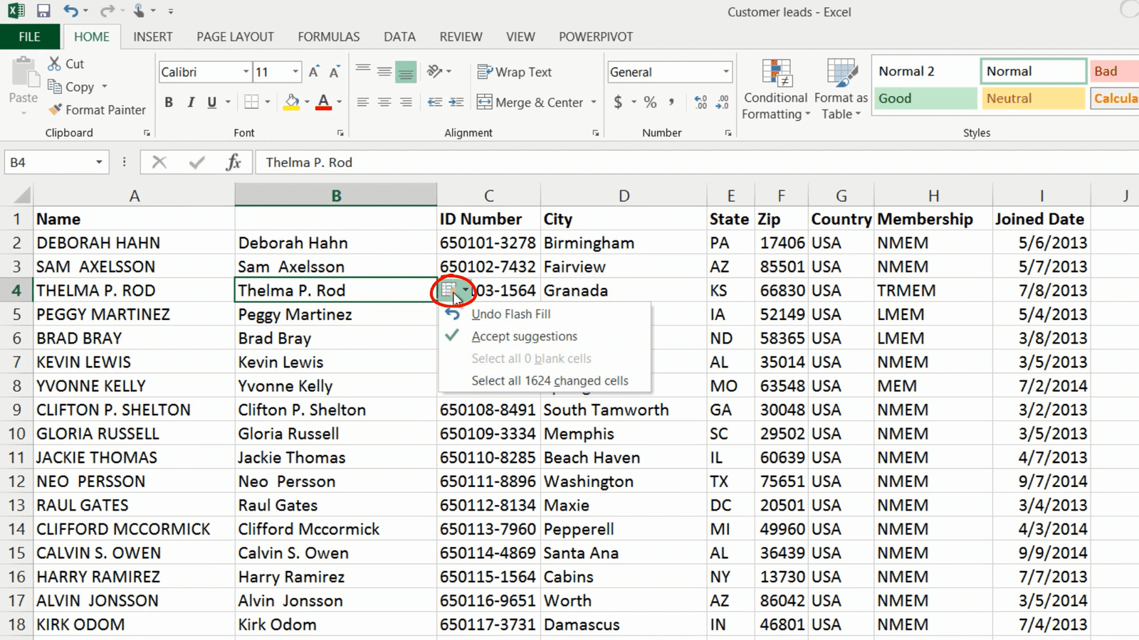
Here I have a spreadsheet with customer leads that I want to modify a bit. First I want to change the “Name” column so that the letters aren’t all upper case. Instead I want it to look like this, with only the initial letter of the first and last name to be capitalized.
To use Flash Fill to modify the names in the first column so that they are not all in upper case, insert a temporary column by right-clicking and selecting “Insert”. Start typing the data the way you want it to appear. In this case, I only want the first letter of the first and last name to be uppercase and then the remaining lowercase. I’ll press Enter and continue with the next cell. Flash Fill automatically kicks in when Excel thinks it has understood the pattern, it suggests what the remaining cells should contain and to accept the changes just press Enter on your keyboard.
A little Flash Fill icon appears allowing you to accept or reject the changes. In this case I’m happy with the changes so I’ll click “Accept Suggestions. “
To copy the modified content to my original column, I’ll select the data range by marking the first cell and then pressing CTRL Shift Arrow down on my keyboard. I’ll hold down the right mouse button and move the contents to the first column, release the mouse button and select “Copy here”. I’ll press CTRL Home on my keyboard to go back to the top. Then I’ll just delete the temporary column by right-clicking the column header and selecting Delete.
Modifying data with simple functions (02:06)
Using Flash Fill you save a lot of time since you don’t have to figure out difficult formulas. In this case the function to use is quite easy if you know it. To convert text to proper case, write equal mark and then PROPER left parenthesis, mark the contents in column A and then press Enter. To copy the formula to all cells just double-click the bottom right corner. To copy over only the contents, right-click and move the data, release the mouse button and select “Copy here as values only”. That way the names, not the formula is copied over.
In this case using the function was very straight-forward, but in many cases even simple modifications require complex formulas. Let’s go back to the original spreadsheet to have a look.
Using Flash Fill to replace complex functions (02:55)
Say that in addition to changing the letters to proper case you want to remove any middle initials. Start typing the names the way you want them. Flash Fill suggests a modification but it hasn’t understood that you want to remove the middle initial. If you don’t agree with the suggested change just keep typing in cells the way you want them to appear.

Here I’ll write in the name without the middle initial and Flash Fill makes a new suggestion. This one is correct so press Enter to accept the change. If you wanted to make the same change without Flash Fill, you would have to use a very advanced formula. For example one that looks like this:
=LEFT(A2,FIND(” “,A2))&TRIM(RIGHT(SUBSTITUTE(A2,” “,REPT(” “,99)),99))
As you can see it’s quite complex and it takes some time to figure it out, so if you want to make modifications like this, Flash Fill is a great time saver.
Splitting a column into two using Flash Fill (03:44)
Now I want to split the Name column into two columns, one with the first name and one with the last name. I’ll insert two empty rows, I’ll mark the column to the right, right-click and select insert. To repeat the same step again press the keyboard shortcut CTRL Y. I’ll type in the headings for the columns, “First Name” and then “Last Name”. To use Flash Fill I will start typing in the first name. To automatically trigger Flash Fill without filling in additional columns, press the keyboard shortcut CTRL E.
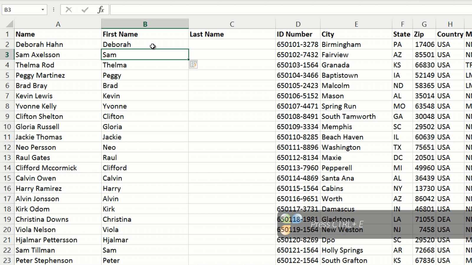
Flash Fill understand the pattern and fills in the first names for me. You can use Flash Fill even for columns that are not next to each other. In the Last name column I’ll write the last name from column A, then I’ll press CTRL + E on my keyboard to trigger Flash Fill. The last names are added to my Last Name column.
Splitting a column into two using “Text to Columns” (04:42)
If you want to split the contents of one column into multiple columns without using Flash Fill you can use the Text to Columns wizard. To split a column into multiple columns, mark the contents of the column you want to split, in this case I’ll mark the contents of the “Full Name” column by marking the first cell that contains the name and then pressing CTRL Shift Arrow Down. Go to the “DATA” tab and click “Text to columns”.
In the first step, just leave the default which is “Delimited”, and click “Next”. In the second step you need to tell Excel how the data should be separated; in this case the first and last name are separated with a space so I’ll deselect the tab separator and instead select the checkbox for “Space”. You get a preview of what the data will look like to make sure that it looks the way you intend.

Click “Next” to go to the final step. Here you need to enter the destination for the split columns. Mark the first cell in the column where you want the split data to appear and then click “Finish”. Now you can see that your data has been split into two columns.
Combining data from multiple columns into one (05:54)
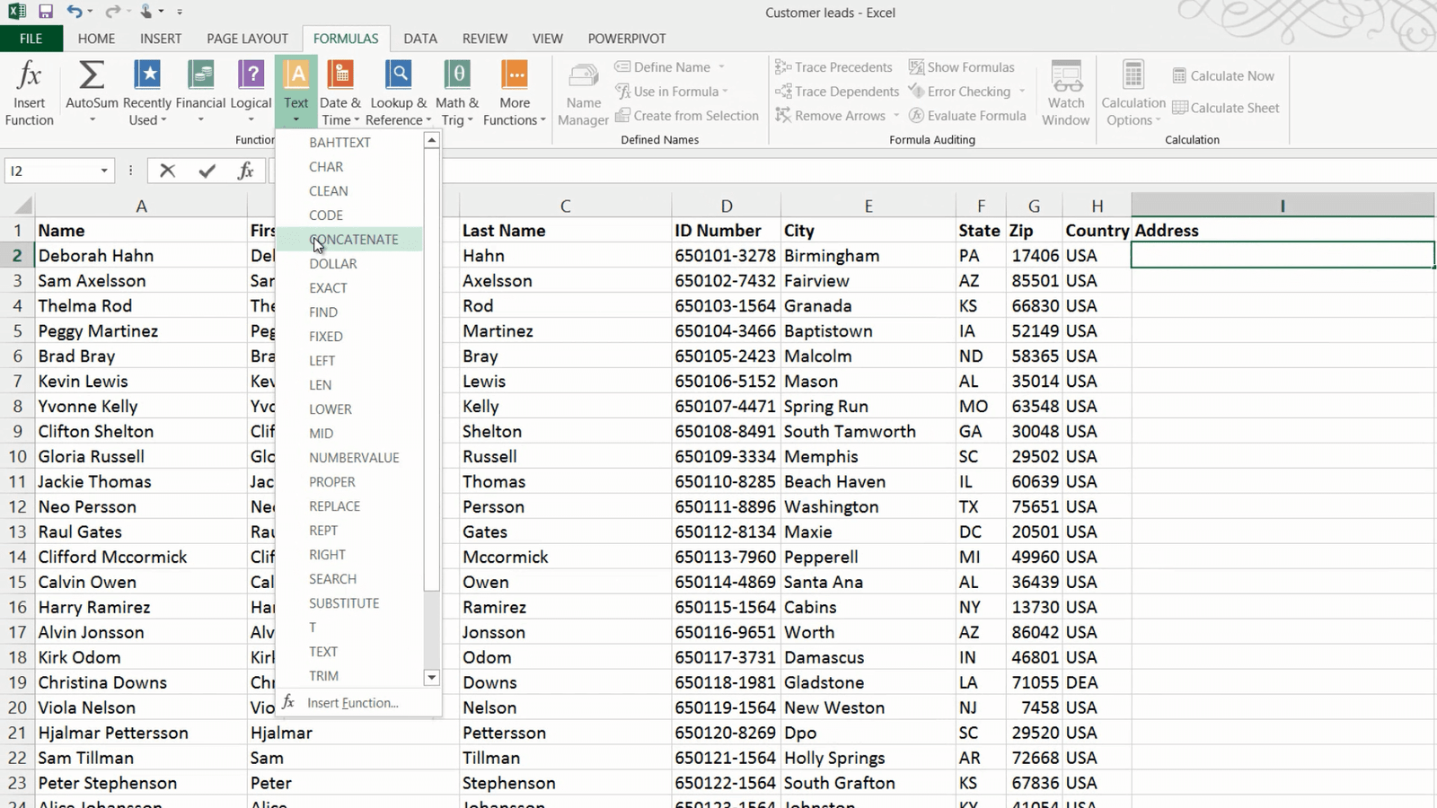
Now I want to add a column called Address that combines the data from the four columns “City”, “State” “Zip” and “Country” into one single cell. If a value is changed in any of these four columns I want the Address column to update automatically which means I can’t use Flash Fill, since Flash Fill only works on existing data, not future changes, so instead I will use a formula to achieve this.
To combine contents from multiple columns into one, mark the cell where you want your results, on the “FORMULAS” tab, click the Text library and select “CONCATENATE”.
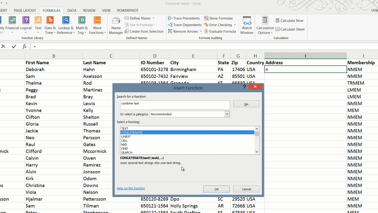
Finding functions (06:34)
If you don’t know what function to use you can search for it and Excel will give you suggestions. To search for a function, on the “FORMULAS” tab click Insert function. Write a short description of what you want to do, here I’ll write “combine text” and then click go. Excel provides you with a list of options and you can see a short description of what the function does. The first one is not right, but the second Concatenate joins text strings together which is exactly what I want to do, so I’ll click OK.
In the formula windows you get to enter the text strings you want to combine. Here I’ll start with “Text1” which is the city name so I’ll mark cell E2, then I’ll add a comma and space, the state name, another space, the “Text5” field should contain the ZIP code which is in G2, to add another text field press Tab on your keyboard. In the “Text6” field I will add a comma and space, press Tab again and mark the country field which is H2 and then I will click “OK.”

The address field is populated with the combined contents and I can copy the formula by just double-clicking the bottom right corner.
Another way to combine text strings is by using the “and” symbol (&) which does the same thing as the Concatenate function. Using the “and” symbol you the formula would look like this instead.
=E2&”, “&F2&” “&G2&”, “&H2
Now if new values are entered in any of the four columns the Address column will be automatically updated.
Replacing data in cells (08:13)
In the column named “Membership” I have a lot of abbreviations. I want to modify the contents of the column so that it looks like this instead. I could use Flash Fill but in this case it wouldn’t be very effective since I would have to write so many names manually to show the pattern. Here it is better to use Find and Replace. To use the replace tool, mark the data range where you want to make the replacements. Here I’ll mark the “Membership” column. On the “HOME” tab, in the Editing section click “Find & Select” and then “Replace”.
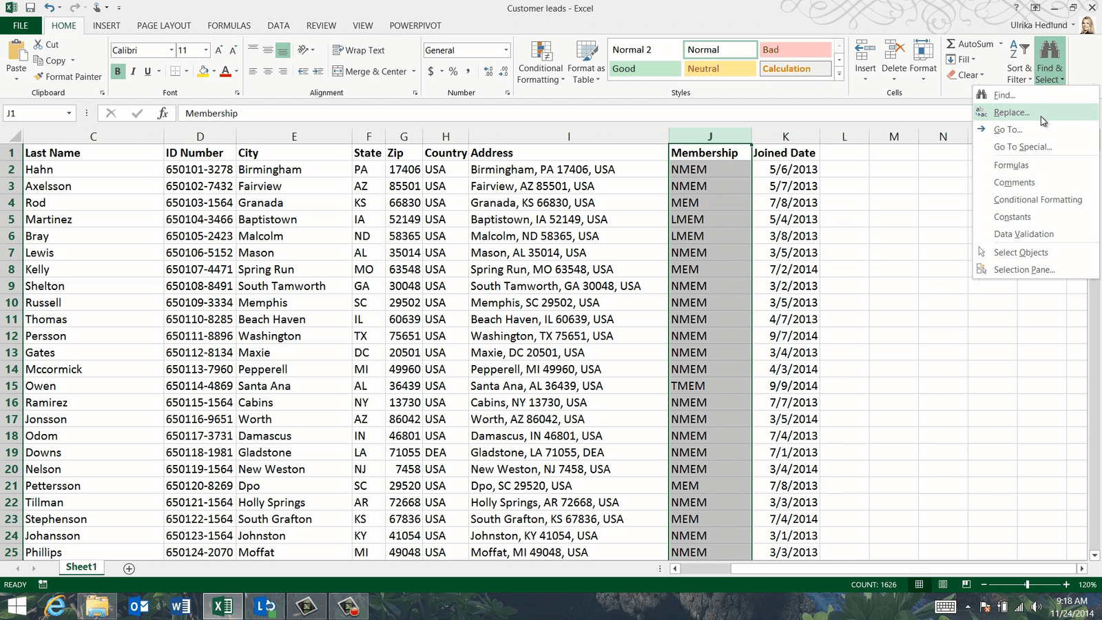
In the “Find what” text box type what you want to find, here I’ll write the abbreviation “NMEM” and in the “Replace with” text box type in what you want to replace it with, I’ll type “Non-Member” and then click “Replace All”. 1253 replacements where done I’ll click OK and continue with the next one.
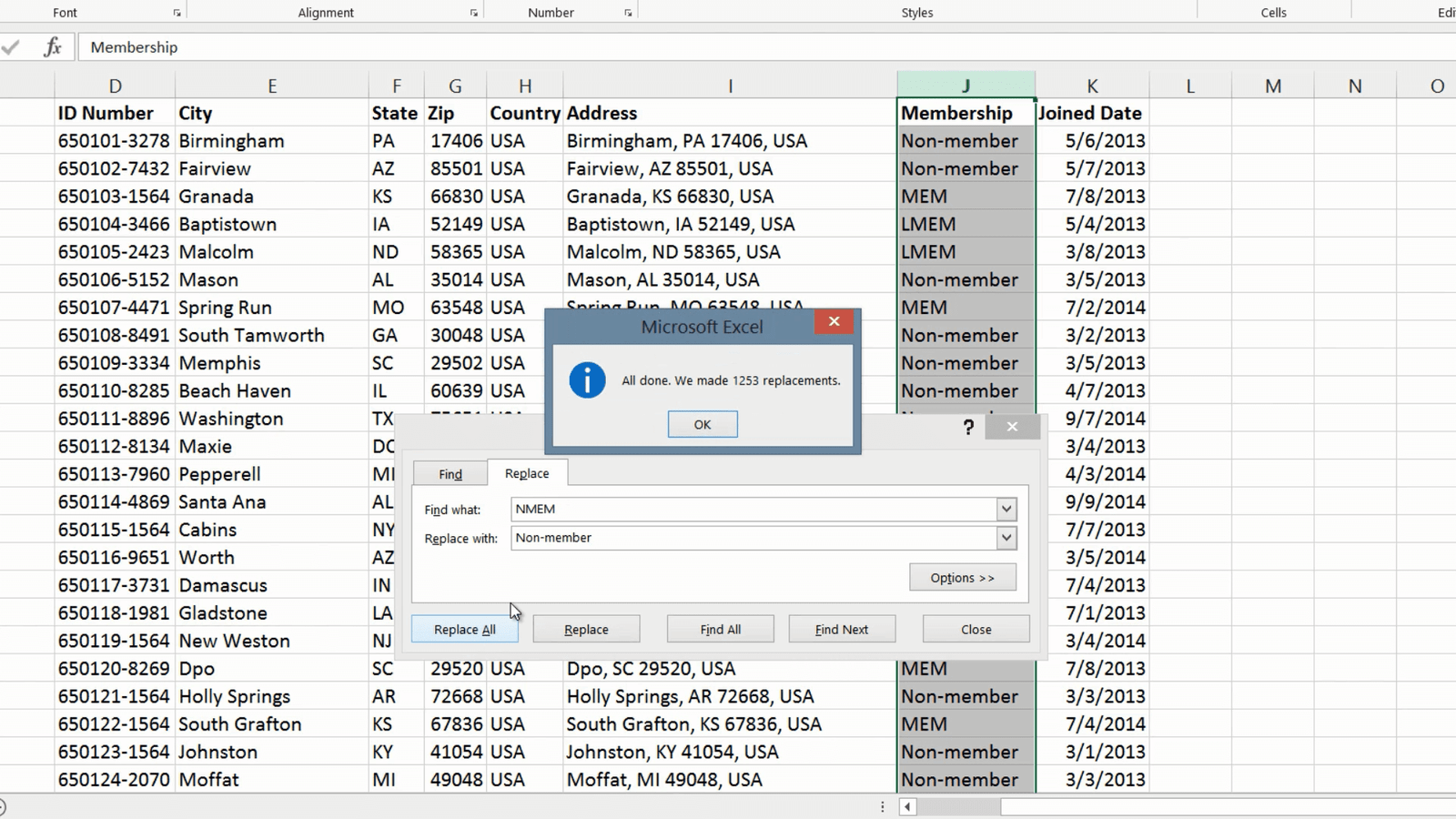
Now I want to replace the abbreviation MEM with Member, but since this letter combination appears in other abbreviations as well I need to click “Options” and mark the option to “Match entire cell contents” then click “Replace All”. I’ll continue to make the replacements using the Replace tool until all the abbreviations are gone. Great, now the data is much easier to comprehend.
Closing (09:37)
By knowing how to use Flash Fill and other tools within Excel, you will save a lot of time when modifying your data.
Introduction (00:04)
The first step for becoming really proficient using Excel is by knowing how to effectively navigate a spreadsheet. In this video you’ll learn how to quickly get a good overview of the contents of your spreadsheet, how to freeze rows and columns, how to navigate between different worksheets and how to compare them side by side. Let’s have a look!
Changing the way the menu appears (00:27)
Here I have our Marketing Budget for year 2015. When you first open up a spreadsheet it’s good to have a look around to get an overview of what the spreadsheet contains. To see more of the contents of your spreadsheet click the “Ribbon Display Options” button in the top right corner. To dedicate your full screen to the spreadsheet select “Auto-hide Ribbon”.
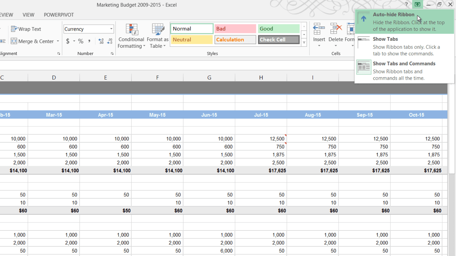
This replaces the Full Screen View that was available in previous versions of Excel. To open up the menu bar again just click the bar at the top, to make it disappear again click anywhere in your spreadsheet. The second option is to show only the tabs. To open up the commands just click on one of the tabs. The third and probably most used option is to always show the tabs and commands. You can easily switch between the two latter options by double-clicking one of the tabs, or by pressing the keyboard shortcut CTRL F1.
Navigating worksheets (01:30)
This spreadsheet contains multiple worksheets. You can easily select another worksheet by clicking on the desired tab. If you’re unable to see all tabs you can reduce the size of the scroll bar by holding down the left mouse button and dragging the three vertical dots to the right. Alternatively you can press the arrows in the bottom left corner to move the tabs left and right.

If you right-click one of the arrows you will see a list of all the worksheets and you can easily open one up by just double-clicking it in the list or selecting one and clicking “OK”. You can also use the keyboard shortcut CRTL Page Down to walk through each worksheet from left to right and press CTRL Page Up to walk through the worksheets from right to left.
Navigating columns and rows (02:21)
This spreadsheet isn’t very large so I can easily see how many rows there are by just scrolling down. If however, you have a very large spreadsheet it can be quite time consuming to scroll to the very end. To quickly get an overview of all the data in a spreadsheet press the keyboard shortcut CTRL End to go to the last row and column. To go back to the top again press CTRL Home. To go to the end of a cell range you can double click the corresponding border of a cell. If I want to see the total budget for salaries here I’ll just double-click the right border of the cell to go to the far right.
Similarly I’ll double-click the left cell border to go back to the far left. The same goes for going to the bottom or top of a cell range. You can also use the keyboard shortcuts CTRL arrow right, CTRL arrow left, CTRL arrow down and CTRL arrow up to accomplish the same thing.
Zooming in and out (03:20)
If you want to change the display size of the contents in your spreadsheet you can zoom in and out. To make the numbers in your spreadsheet appear larger, mark the cell that you want to see in the top right corner and then zoom in by dragging the zoom slider in the bottom right corner to the right.
Another quicker way to zoom in and out is to hold down the CTRL key on your keyboard while turning the wheel on your mouse. If you have a touch pad you can zoom in by moving two fingers apart and zoom out by pinching them together.
If you want to focus in on a specific area of your spreadsheet – here for example I want to look at personnel costs for the first quarter, mark the range of cells you want to focus in on, go to the “VIEW” tab and click “Zoom to Selection”.

Now I get a very focused view on those particular numbers. To zoom back out again I’ll just click the 100% button on the “VIEW” tab.
Freezing rows and columns (04:18)
When I scroll to the right in the spreadsheet it’s hard to know which row a certain cell belongs to. To always see your row or column headings you can freeze panes. To freeze a row or column, on the “VIEW” tab, under the “Window” section click “Freeze panes”. Here I’ll select to Freeze the first column.

Now I can scroll to the right and still see the row headings. Now I want to do the same for the column headings. I have the option here to “Freeze top Row”, however in this case this doesn’t really help me because I have my column headings on the 4th row. I’ll go back and select to “Unfreeze Panes”. To freeze any row of choice, mark the row underneath the one you want to show, click “Freeze Panes” again and select “Freeze Panes”.
Now you can see that that the 4th row has been frozen and I can scroll down and still see which column belongs to which month. To freeze both the row that has the column names and the column that has the row names mark the cell to the right of the column and underneath the row you want to freeze and select “Freeze Panes”.
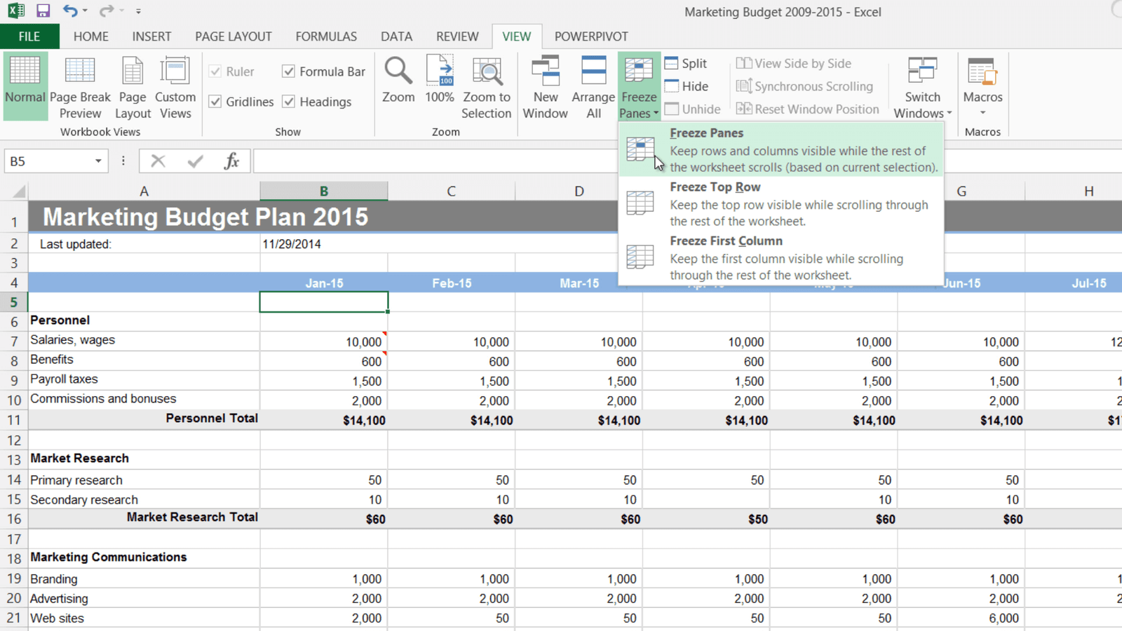
Now both the row and the column headers keep still when I scroll my document.
Hiding columns, rows and sheets (05:40)
Here I have a column where I’m just calculating the marketing budget increase from the year before. If I don’t want this to be visible in the report I can select to hide this column. To hide a column, right-click and select “Hide”.
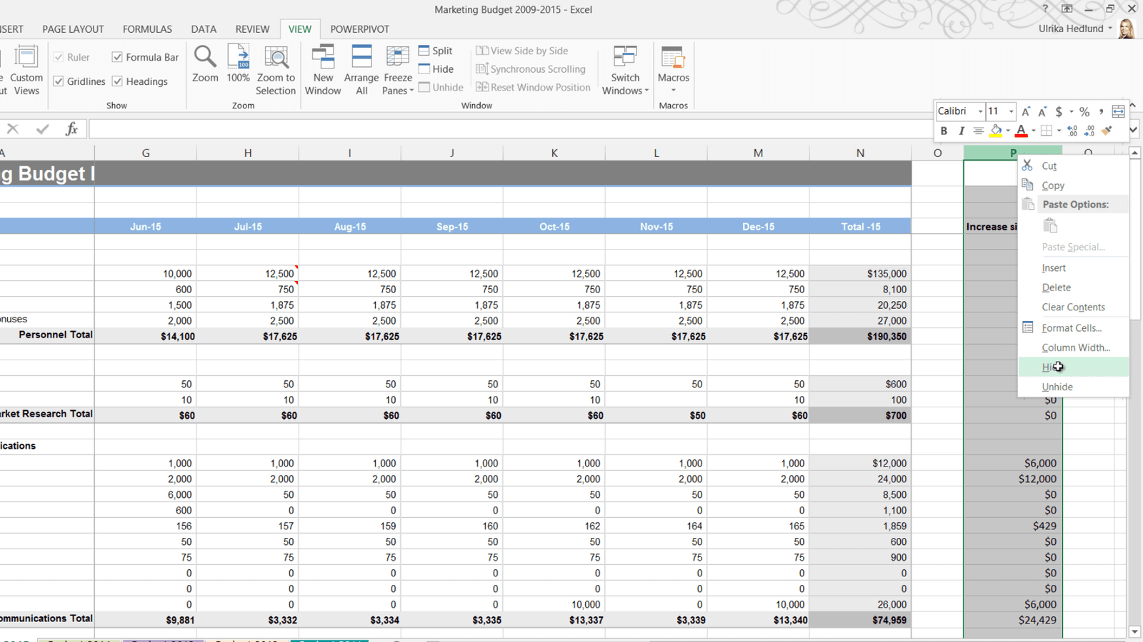
You can see that the column is hidden because there is a gap between O and Q. In Excel 2013 hidden columns and rows are easier to spot since they are also shown with a double line.

Now I only want to show the last quarter so I’ll mark the nine first months, right-click and “Hide”. To mark multiple, un-adjacent rows or columns hold down the CTRL key on your keyboard. Here I’ll mark all the budget item rows where we haven’t allocated any money in the budget. I’ll release the CTRL key, right-click and select “Hide”.
To get a better overview of all hidden rows and columns, on the “HOME” tab, click “Find & Select”, “Go To Special” and select “Visible cells only” and click “OK”.
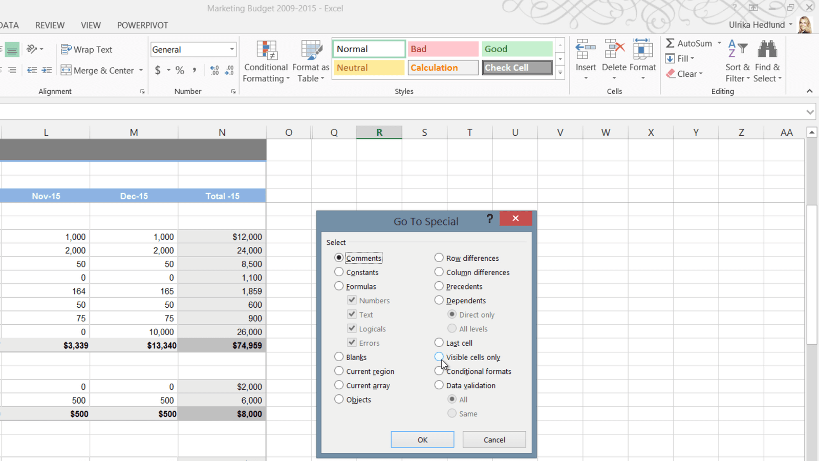
As you can see all hidden rows and columns are marked with white lines, making them easier to see.

To unhide a row, mark the adjacent rows, right-click and select “Unhide”, or just double-click the hidden row. The same goes for un-hiding columns.
If you want to unhide all hidden rows and columns at once, mark the entire worksheet by clicking the top left corner between A and 1.
On the “HOME” tab, in the “Cells” section, click “Format”, “Hide & Unhide”, and then select “Unhide Rows” and then select “Unhide Columns”.
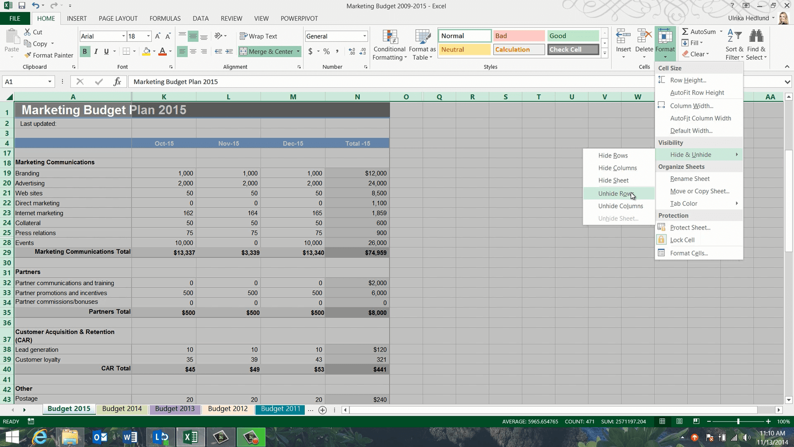
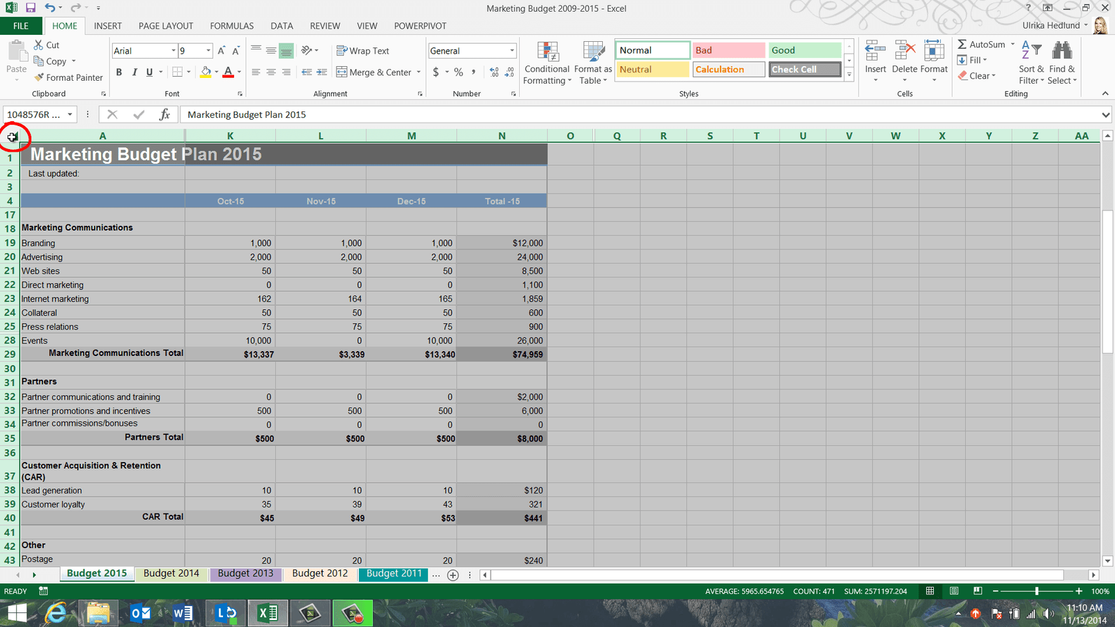
You can also hide entire worksheets. To hide the budget for 2009, I’ll step to the right to make the worksheet visible. I’ll right-click the sheet tab and select “Hide”. To unhide it, I can click any sheet and click “Unhide” and select the hidden worksheet that I want to show again.
Using split panes to compare rows and columns (07:47)
Now I’d like to compare the budget for the month of January with the month of December. To easier compare columns side by side I’m going to split my window into multiple panes. To split your spreadsheet into multiple windows, mark the cell underneath to the right of where you want to place the center of the split, on the “VIEW” tab click “Split”.
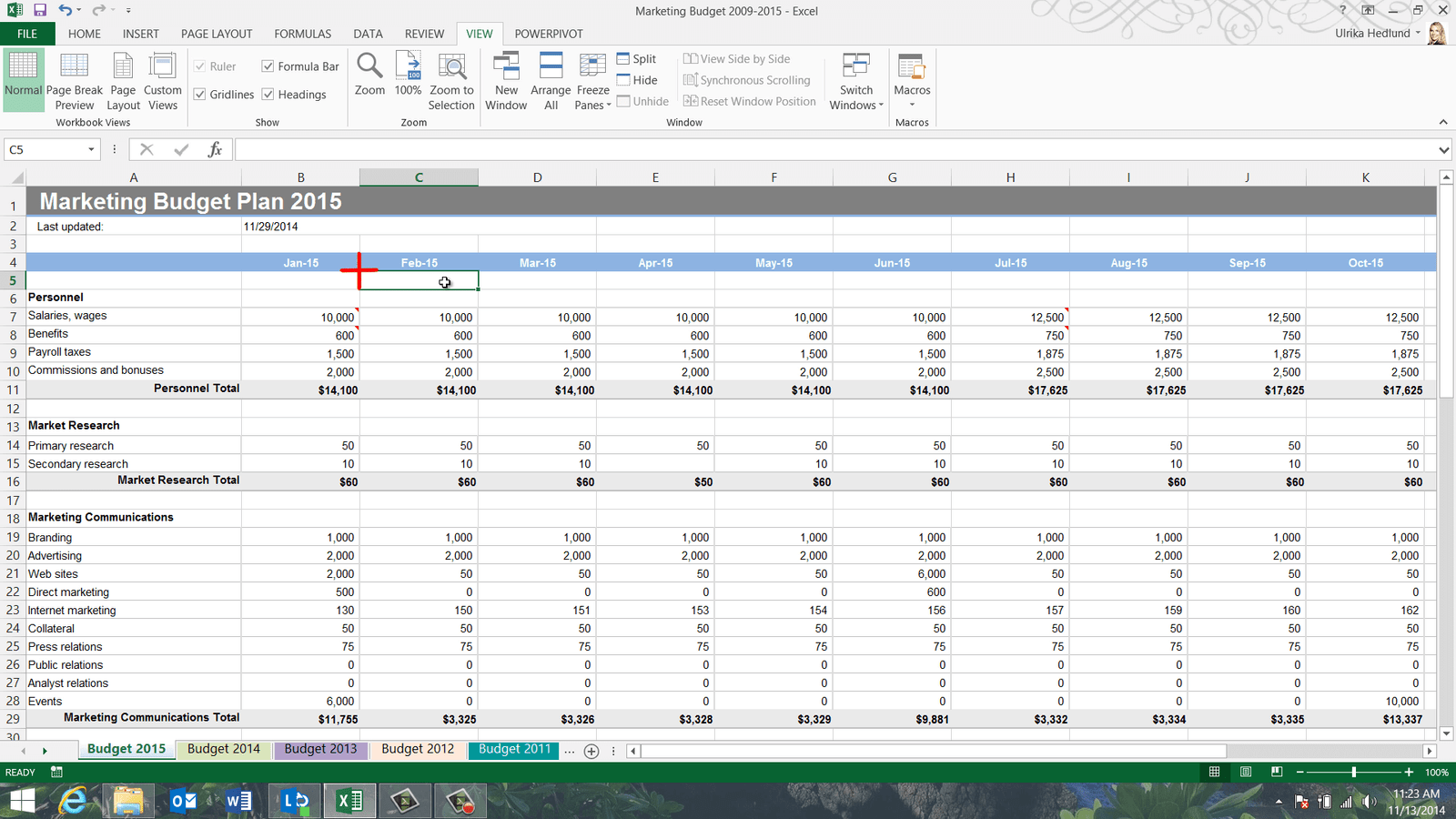
At the bottom of the spreadsheet I have two independent scroll bars. I’ll scroll to the right in the right pane so that I can see the month of December. Now it’s much easier for me to compare January and December side by side.
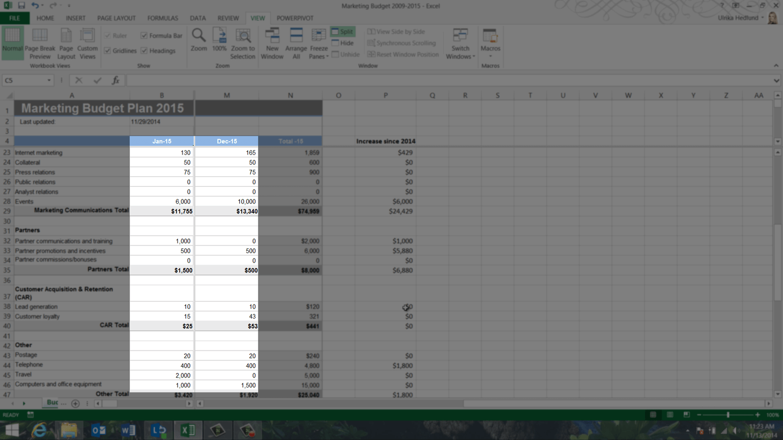
If I want to compare any other months side my side I can easily move the split and scroll each pane. To remove the splits on the “VIEW” tab click “Split” again, or just mark the center of the split and double-click.
View worksheets side by side (08:41)
Now I want to compare the budget for 2015 with the budget for 2014. To compare two worksheets side by side, on the “VIEW” tab click “New Window”.
Excel opens up a second window showing the same spreadsheet. Unlike in previous versions, each window in Excel 2013 has its own menu bars so that it’s easier to work on multiple monitors. In the window marked with colon 1 I’ll open up the worksheet with the budget for 2014. To see these windows side by side on the “VIEW” tab click “View Side-by-Side” and make sure that “Synchronous Scrolling” is turned on under the “VIEW” tab to scroll both windows simultaneously.
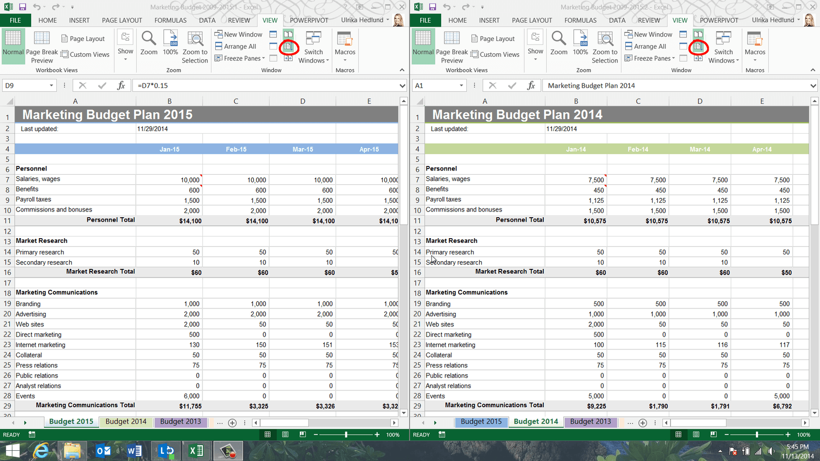
Now I can easily compare the windows side by side. If I want to scroll each window independently I’ll click “Synchronous Scrolling” on the “VIEW” tab to turn it off, and then I can scroll them one by one. To go back to the original view, just close down one of the windows.
Closing (09:50)
By knowing how to effectively navigate a spreadsheet you’ll be much more proficient using Excel.
Automate calculations using Lookups
Introduction (00:04)
Sometimes when you are doing calculations you need to base your numbers on a certain criteria. For example, the amount you pay your employees might depend on how well they have performed. In this video you will learn how to use lookup functions in Excel to fine-tune your calculations.
Showing formulas in a spreadsheet (00:23)
Here I have a marketing budget that I’ve started to fill out.
Some of these numbers I’ve added manually, but some of them are calculated using formulas. To get a good overview of all the formulas in a spreadsheet you can go to the “Formulas” tab and in the “Formula Auditing” section click “Show Formulas”.
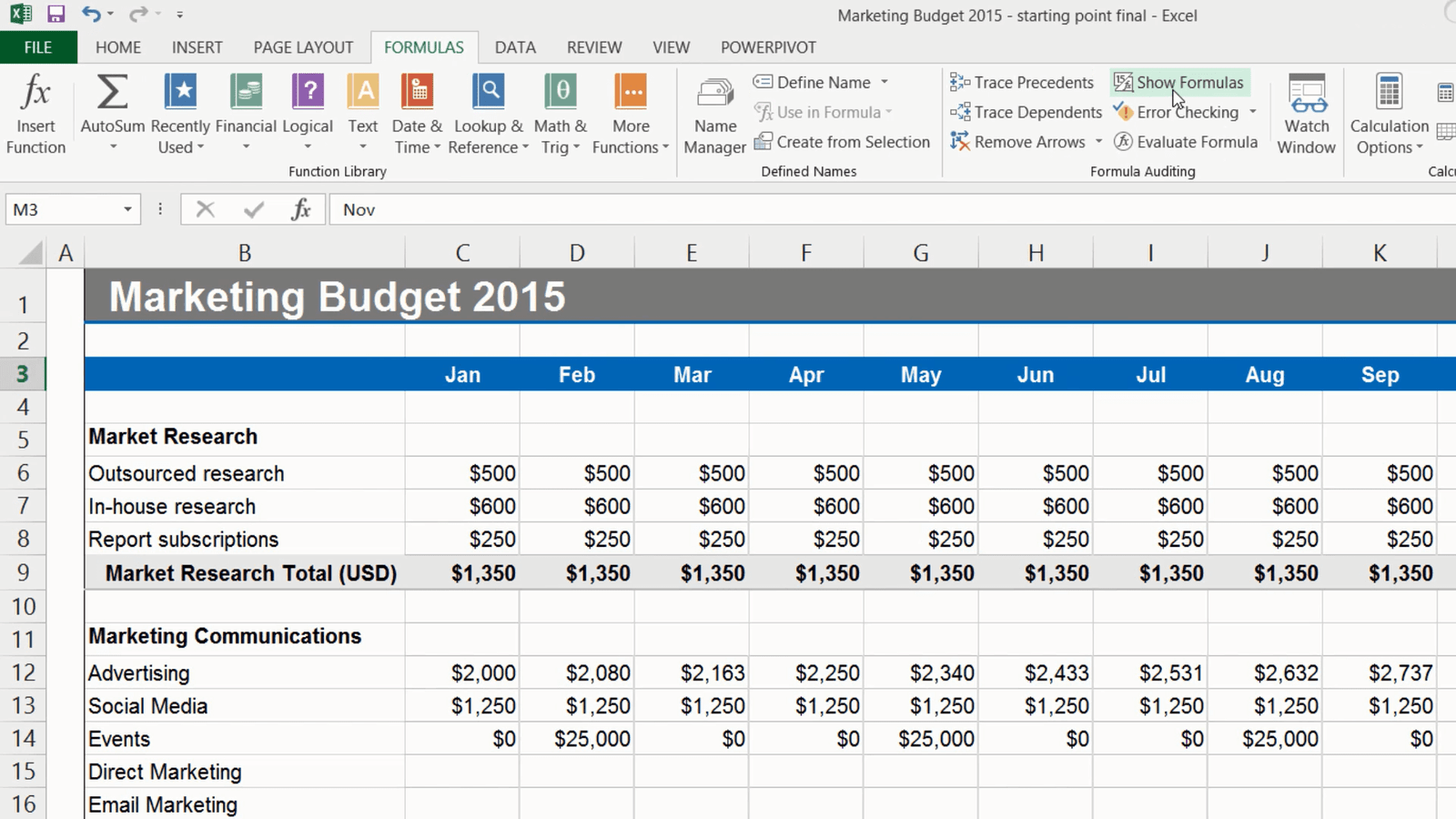
Now all the formulas in the spreadsheet become visible. You can also access this by pressing the keyboard shortcut CTRL + Accent Grave or CTRL + Tilde if you have a US keyboard. To go back to the normal view again I’ll click “Show Formulas”. Another way to get a good overview of the formulas in your spreadsheet is by highlighting those cells. You can do that by going to the “Home” tab, and in the “Editing” section click “Find & Select” and then in the drop down select “Formulas”.

All the cells with formulas will be selected. If you want to have better visibility of these cells you can highlight them using a different cell background color. I’ll click “Undo” here to go back to the original cell color.
Using the “IF” function (01:34)
Now I’m going to continue filling out this budget, so I’ll go to the first empty line item which is “Direct Marketing”. Here I want to allocate a fixed monthly amount of 250 dollars but the months where we are investing a lot of money on events, 10,000 dollars or more, I want us to double that amount and make it 500 dollars. Instead of manually tracking which months have 10,000 dollars or more budgeted for events I’m going to use a lookup formula which will do this for me. I’ll start by entering an equal sign to start the formula, then I will write IF, left parenthesis and here I can see that Excel helps me with the formula.
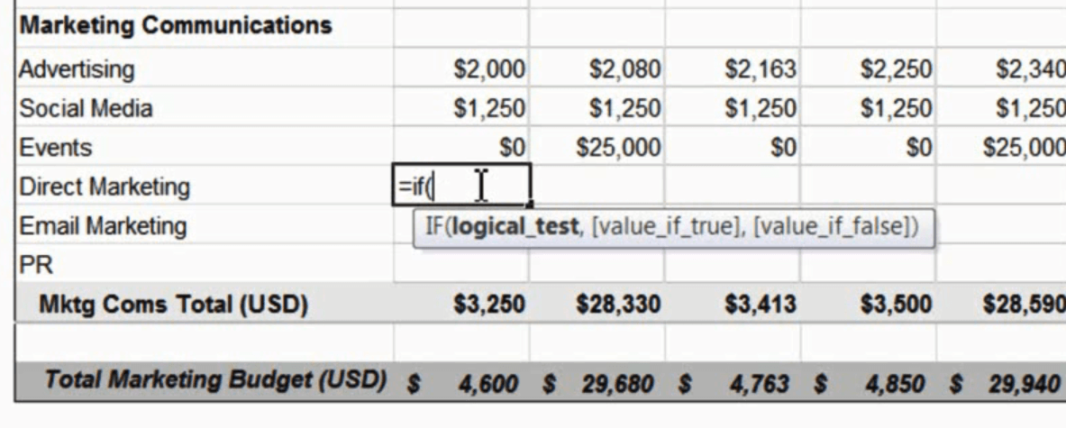
First I have to enter the so called “logical test”, so I’ll say, if the budgeted cost for the event that I have for January in cell C14 is larger (>) or equal (=) to 10,000, and then a comma, then the direct marketing budget should be 500 so I’ll type 500 and then a comma again, otherwise it should be 250. I’ll complete the formula with a right parenthesis.

There! Now, let’s copy this formula to all the cells to see if we get the right result. That looks right. The months where we have the events that cost ten thousand or more we spend 500 dollars in direct marketing, otherwise we spend 250.
Using formulas in your IF statement (03:09)
For email marketing we have a fixed monthly fee of 200 dollars, but the months where we have events that cost 10,000 or more I want to add an additional 1 percent of the event cost to the 200 dollars. So to do that I need to add some more calculations to my IF statement.
I’ll start with an equal sign, type IF again and left parenthesis, for the logical test I’ll first mark the cell containing the Events cost for January; C14, if this is larger (>) or equal (=) to 10,000 dollars, comma, if this is true I’ll add 200 dollars, plus (+) 1 percent times (*) the event cost, comma, otherwise I’ll just add 200 dollars. I’ll end with a right parenthesis and then “Enter”.

Now, I’ll copy this formula again across all the months. You can see that I now have more money allocated for email marketing each quarter when I have my large events.
Make your formulas easier to read with named cells (04:1)
If you use a value over and over again, or if you want to test different scenarios by changing values, or if you just want to make your formulas easier to read, you can give your cells a name. Let’s change the email marketing formula and make use of named cells instead.
First I’ll type “Email Marketing monthly fixed” and enter the 200 dollars which is the fixed cost every month in the cell to the right. Then I’ll write “Email Marketing event increase” and enter the 1%.
Instead of referring to these cells as C23 and C24 I will name them. There are multiple ways in which you can name your cells. You can mark the cell and type in a name in the text box up here,
I’ll click ESC to show you another way.
If you go to the “Formulas” tab and click “Define Name” you can enter the name here in this text box. Excel has automatically taken the text to the left of the cell and added it as a name with underscore signs instead of spaces. You can keep this name or change it here in the textbox.

I’ll click Cancel and show you the third way. Mark your cells, the ones with the names and the ones with the values and click “Create from Selection.”
Here you need to tell Excel which cells you want to use for the name, and in our case its’ the cells to the left, and then Excel creates the names for me. If you click “Name Manager” you can see all the names you have in your spreadsheet. Here you can add new names, or change and delete existing names in your spreadsheet.
Use cell names instead of numbers (06:08)
So let’s go back to our formula again and use these cell names instead of numbers. As I start typing the name you will see all the matching names appear in the drop down box.

Here I want to select the fixed fee which is the bottom one so I’ll press arrow down on my keyboard and then press TAB to select the highlighted option. Then I’ll add the percentage increase and multiplied with the amount budgeted for the event. I’ll add a comma and then enter the name for the fixed fee. I’ll end with a right parenthesis and press Enter.

Now I’ll copy this updated formula across all months.
Now I can easily try different scenarios. Say for instance that I want to increase the fixed amount to 250 dollars and the percentage increase to 3%. I can see the results in my budget right away.
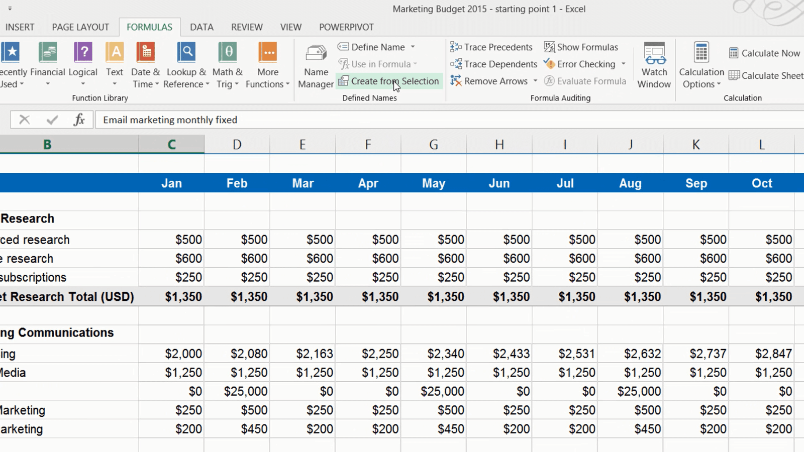
Using the VLOOKUP formula to look up values (07:05)
Next I want to budget for our PR. Our PR agency charges different fees depending on their media outreach performance. If their performance is 5, the cost is 5000 dollars a month, if it’s 4 it’s 3000 and so on.
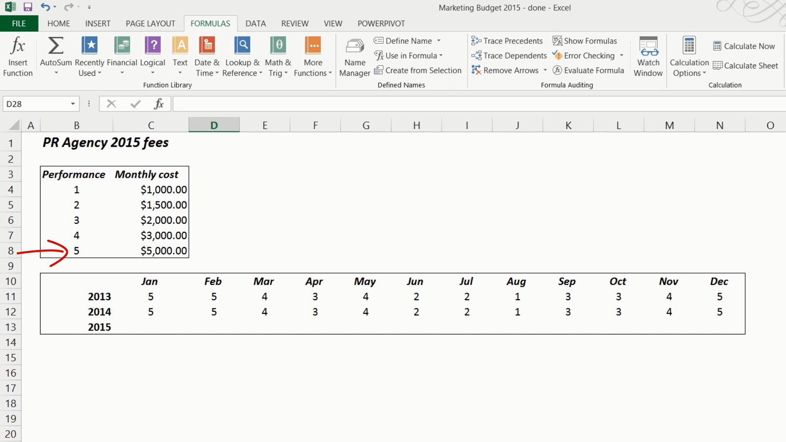
For budgeting purposes I’ll just assume that they will have the same performance this year as last. Now I need a formula that can check the performance number for the month, look it up in this table and give the value in this column.
I’ll go to my budget and enter the formula: Equal sign (=) and then I’ll start typing VLOOKUP and select it in the drop down list by pressing TAB on the keyboard. First is the “lookup_value”, this is the value I want to look up in the table, so I’ll go back to my PR sheet and mark the first cell for January and then I’ll press comma, to enter the “table_array”, here I need to mark the columns in my lookup table with values, I won’t include the headers,
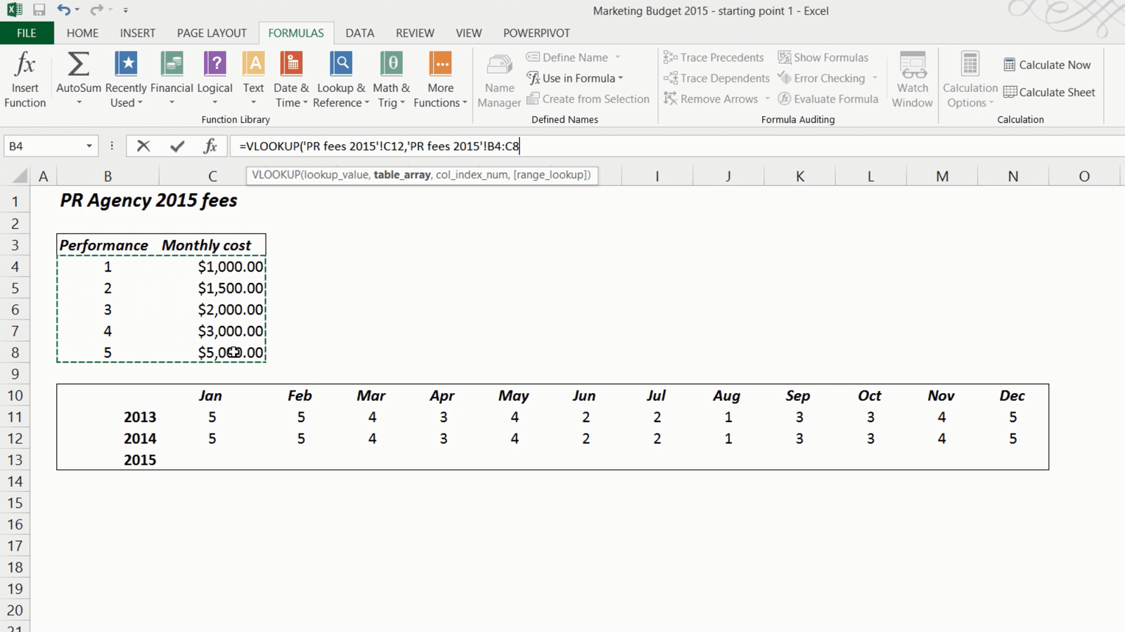
here I’ll press F4 to make the table absolute, meaning that if I copy the formula it should always refer back to these exact cells for the lookup table.
I’ll press comma again to get to the next value which is “column_index_number”, this is the number of the column of your lookup table that has the value that should be returned, in our case it’s the 2nd column that contains the values. Finally I’ll press comma again and here I can select TRUE or FALSE. False means that the numbers are exact, meaning that there is no performance of 4.5.

OK, let’s try this. The first result is 5000 which is correct, now I’ll just copy the formula across all months. There! It worked! Now we are done fine-tuning our budget!
Introduction (00:04)
When you are analyzing data it helps to look at it from different perspectives. For instance, how much did we sell last month? Or how much did we spend this year compared to last? A very powerful tool for analyzing data that you quickly want to summarize is the PivotTable in Excel. In this video you’ll learn how to use a PivotTable to analyze data.
Inserting a PivotTable (00:31)
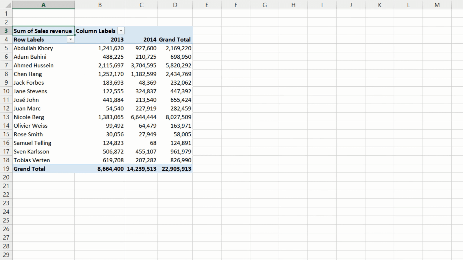
Here I have a list with sales transactions for 2013 and 2014. I need to analyze this data better to understand our sales performance.
First I want to know what our sales where in 2014 compared to 2013. One way to do this is to filter the column with Sales Year and select 2014 and click OK. To see the summary of all sales I’ll mark the Sales Revenue column and then note down the total sum which is shown in the notification bar. To see the sales for 2013 I’ll just change the filter to 2013 and then note down that sum. Even though this is a way to find what I am looking for, it’s very clumsy and not very effective – for this type of analysis it is much better to use a PivotTable.
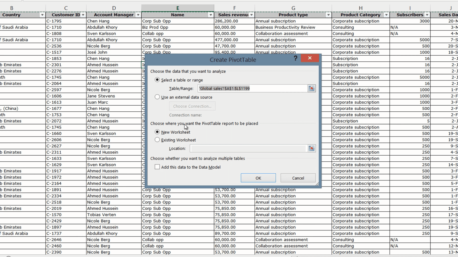
To create a PivotTable, click any cell in your data range, click “INSERT” and then click “PivotTable”. Excel selects the data range for you and you can select where you want the PivotTable to be placed. I’ll just leave the default, which is to insert it into a New Worksheet and then click OK.
Now you have the PivotTable on your left and the PivotTable fields on the right. If you have a lot of fields and you don’t want to scroll you can change the layout by clicking the Tools button and selecting “Fields Section and Areas Section side-by-side”. But in this case I don’t have that many fields so I’ll go back to the default view.
Analyzing data in the PivotTable (02:01)
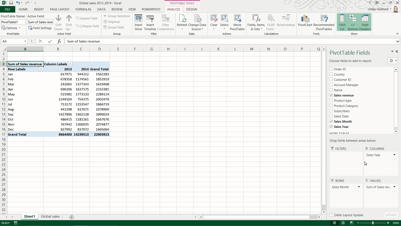
To analyze data in a PivotTable you need to add number fields to the Values area. I’ll select the “Sales Revenue” field, since this is a numerical data type, it is automatically added to the Values area. Right away you can see the total sum of sales revenue for 2013 and 2014 combined. To see the breakdown per year, drag the “Sales Year” field and place it in the Row labels area. Now you can easily compare the sales for 2013 with the sales for 2014.
To break down the sales by month, I’ll select “Sales Month” and put it under “Sales Year”. Now I can see the breakdown per month. I will move the “Sales Year” field to the Columns Area to make it easier to compare the months side by side.
To close down the PivotTable task pane just click anywhere outside the PivotTable. To open it up again click any cell in your PivotTable.
Changing the number format (03:00)
To make the PivotTable easier to read you can change the way the numbers are displayed. To change the number format, right-click any number cell and select “Number format”. Here I’ll select “Number”, I’ll remove the decimals and add a thousand comma separator. I’ll click OK to apply the changes. Now the numbers are easier to read.
Changing how values are shown (03:24)
By just looking at the data in the PivotTable I can see that we had the largest sales revenue in May 2014. To see what percentage this is of the Grand Total sales, right-click and select “Show Values As” and select “% of Grand Total”.

I can immediately see that May 2014 alone accounted for 7.74 percent of the grand total sales revenue for the two years. To see how much it accounted for in 2014 right-click again and select “Show Values As”, % of Column Total. Now I can see that it accounted for 12.45 percent of the year total. To go back to showing the sum of sales revenue again, I’ll right click, select “Show Values as” and select “No calculations”.
Changing how values are calculated (04:15)
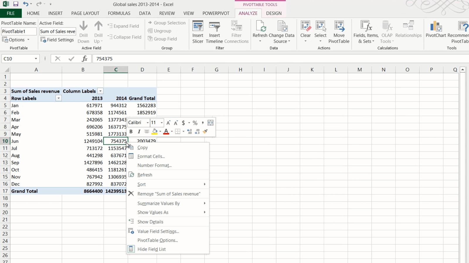
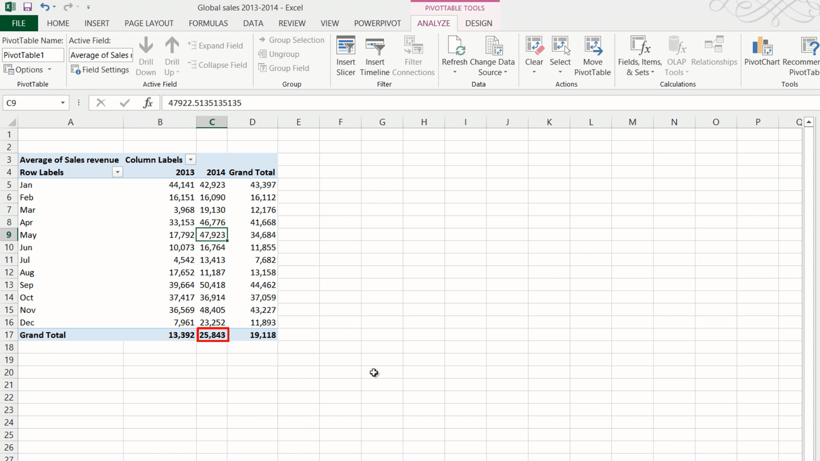
By looking at the data like this I can see the total sales revenue each month. To understand the number of transactions, you can change the calculation method. To change how values are calculated, mark a number cell and right-click, select “Summarize Values by” and then select your calculation method.

In this case I’ll select “Count” and I can see that in May we did 37 deals which is less than in many of the other months. To see what the average deal size is right-click again select “Summarize Values By” and select “Average”, here I can see that the average deal size in May was approximately 48,000, much higher than the year average which was about 26,000. To go back to show the sum of sales revenue again, right-click and select “Summarize values by Sum”.
Drilling down to the details of the underlying data (05:10)
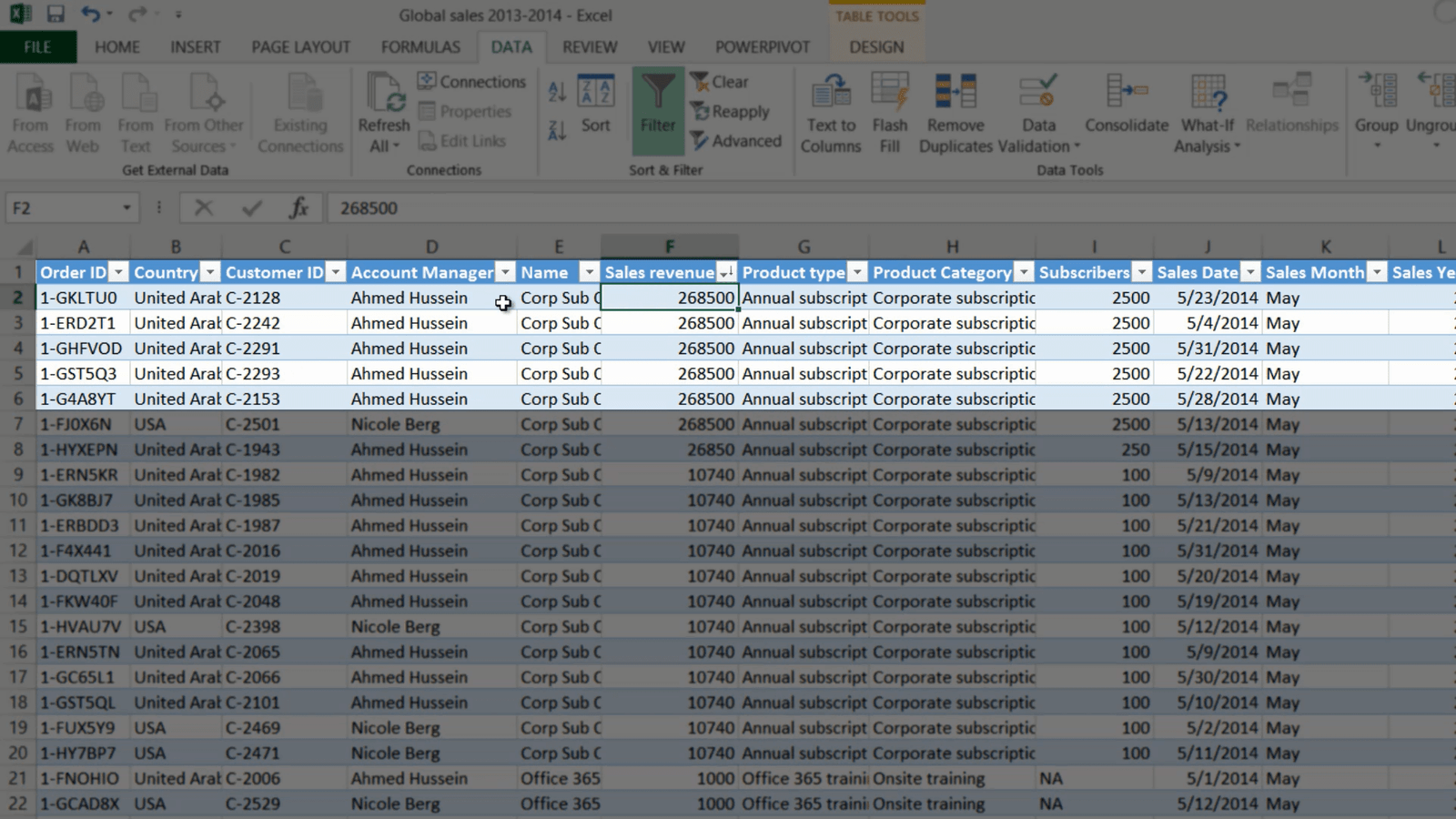
If you want to see the underlying data that is the basis for the aggregation in your PivotTable, just double-click the cell in the PivotTable. A new worksheet opens up showing you the data for that cell. Here I can see all the 37 transactions for the month of May 2014. By sorting the data by Sales Revenue I can see that Ahmed Hussein was the account manager that sold most of the largest deals. If you don’t need these details, you can just right-click the sheet and select “Delete” click “Delete” again to go back to your PivotTable.
Moving data around to see it from different perspectives (05:45)
To get a better understanding of the Account Manager’s performance I can change the fields of my PivotTable.
To see your data from different perspectives you can easily drag and drop data fields around. To remove a field just uncheck it in the field list, or drag it outside the PivotTable area until you see the Delete symbol. To see the performance of the Account Managers, I’ll add the “Account Manager” Field to the Rows Area. Now I can see how much each Account Manager has sold for.
Sorting and filtering data in your PivotTable (06.17)
To see which Account Manager sold the most in 2013 I can easily sort the data in my PivotTable. To sort a PivotTable on a specific column, just right-click any cell in the desired column and select “Sort”, here I’ll select “Largest to Smallest”.

Here I can see that Ahmed sold the most in 2013. To see who sold the most in 2014 I’ll right-click a cell in the 2014 column, select “Sort”, “Largest to Smallest”. In 2014 Nicole sold the most, much more than any of the other Account Managers. In addition to the sorting tools you can also use filters. To see the top 5 Account Managers in 2014, I’ll first select the Column filter and select only 2014 and click OK. Then I’ll click the Row filter, select “Value Filters”, “Top 10” and then change from 10 to 5 top items and click OK, and here I can see my 5 best performing Account Managers in 2014. To remove the filter again, just mark the filter icon and click “Clear filter”, or go to the Field list and click the Filter icon there to clear the filter.

Changing the look and feel of your PivotTable (07.37)
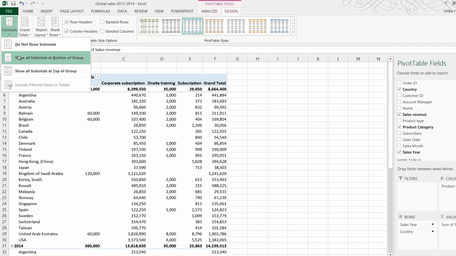
I’ll re-arrange the PivotTable again to see the product category sales in each country. I’ll deselect the “Account Manager” check box and move the “Sales Year” field to the Row area, and move the “Product Category” to the column area and “Country” to the row area.
To change the layout of the PivotTable click the PivotTable Tools “DESIGN” tab. To change the way the subtotals are displayed click “Subtotals”. I want to display the subtotals for each column under the column instead of on top, so I’ll click “Show all Subtotals at Bottom of Group”. You can also change how Grand Totals are shown. Here I’m just interested to see the Grand Total per Category so I’ll click “Grand Total” and select “On for columns only”.
To add more space between each section, click “Blank Rows” and then “Insert Blank Line after Each item.” Now it’s easier to see each year separately.
You have a number of options for changing the PivotTable design. Click “Report Layout” to select between different styles. If you select “Show in tabular form” you see each value in its own cell. In order to see all fields when you are scrolling up and down in your PivotTable click “Report Layout” and select “Repeat all Item Labels”.
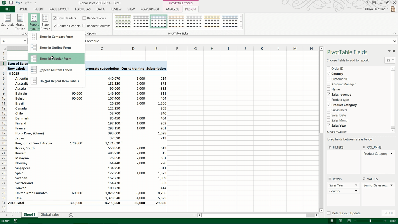
Here I’ll click “Undo” and go back to the compact view which frees up more space.
If you find it hard to see which number belongs to what row, on the “DESIGN” tab, in the “PivotTable Style Options” section, check the option for “Banded rows”. For now I will just uncheck this option.
In this PivotTable, there are a number of empty cells, if you prefer to see these cells as zero, right-click any cell and select “PivotTable Options” under the “Layout and Format” tab, type in zero where it says, “For empty rows show”. Click Ok to apply the change.
Closing (09:45)
Now you can continue with your analysis and slice and dice your data to find valuable business insights.