
Analyze data in a PivotTable
Introduction (00:04)
When you are analyzing data it helps to look at it from different perspectives. For instance, how much did we sell last month? Or how much did we spend this year compared to last? A very powerful tool for analyzing data that you quickly want to summarize is the PivotTable in Excel. In this video you’ll learn how to use a PivotTable to analyze data.
Inserting a PivotTable (00:31)
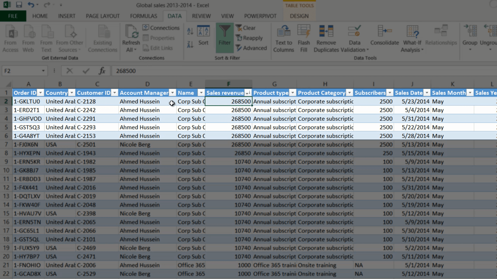
Here I have a list with sales transactions for 2013 and 2014. I need to analyze this data better to understand our sales performance.
First I want to know what our sales where in 2014 compared to 2013. One way to do this is to filter the column with Sales Year and select 2014 and click OK. To see the summary of all sales I’ll mark the Sales Revenue column and then note down the total sum which is shown in the notification bar. To see the sales for 2013 I’ll just change the filter to 2013 and then note down that sum. Even though this is a way to find what I am looking for, it’s very clumsy and not very effective – for this type of analysis it is much better to use a PivotTable.
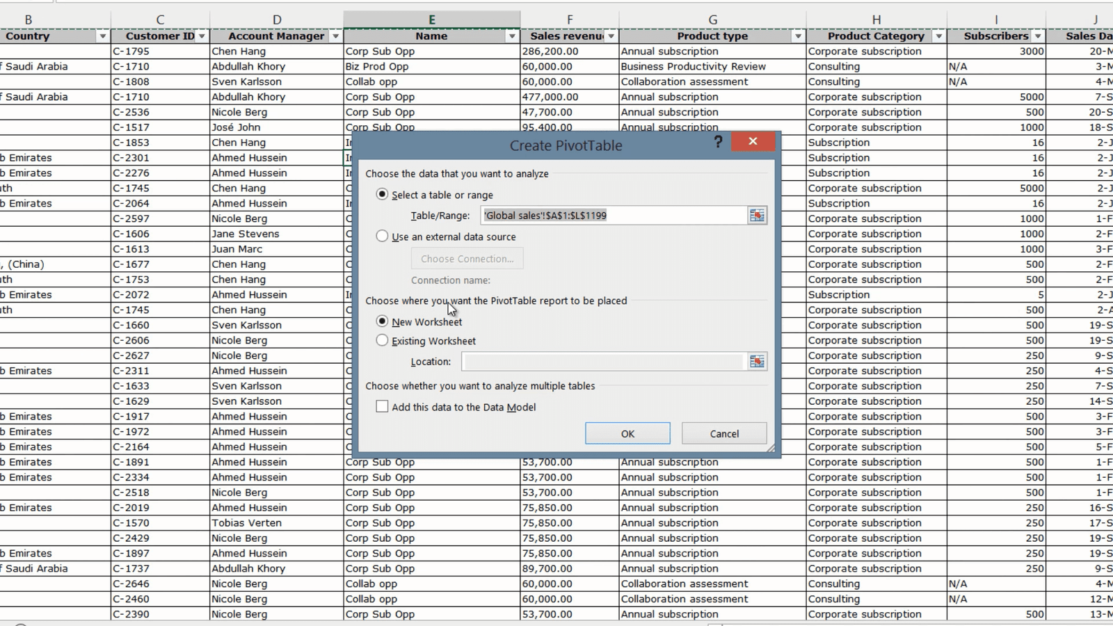
To create a PivotTable, click any cell in your data range, click “INSERT” and then click “PivotTable”. Excel selects the data range for you and you can select where you want the PivotTable to be placed. I’ll just leave the default, which is to insert it into a New Worksheet and then click OK.
Now you have the PivotTable on your left and the PivotTable fields on the right. If you have a lot of fields and you don’t want to scroll you can change the layout by clicking the Tools button and selecting “Fields Section and Areas Section side-by-side”. But in this case I don’t have that many fields so I’ll go back to the default view.
Analyzing data in the PivotTable (02:01)
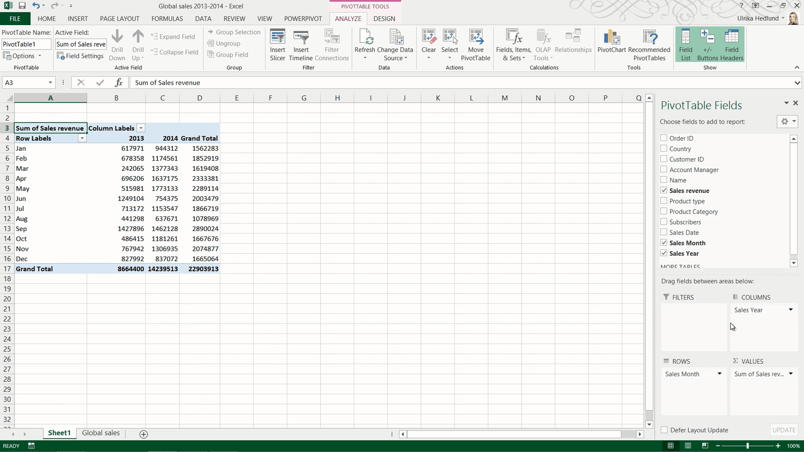
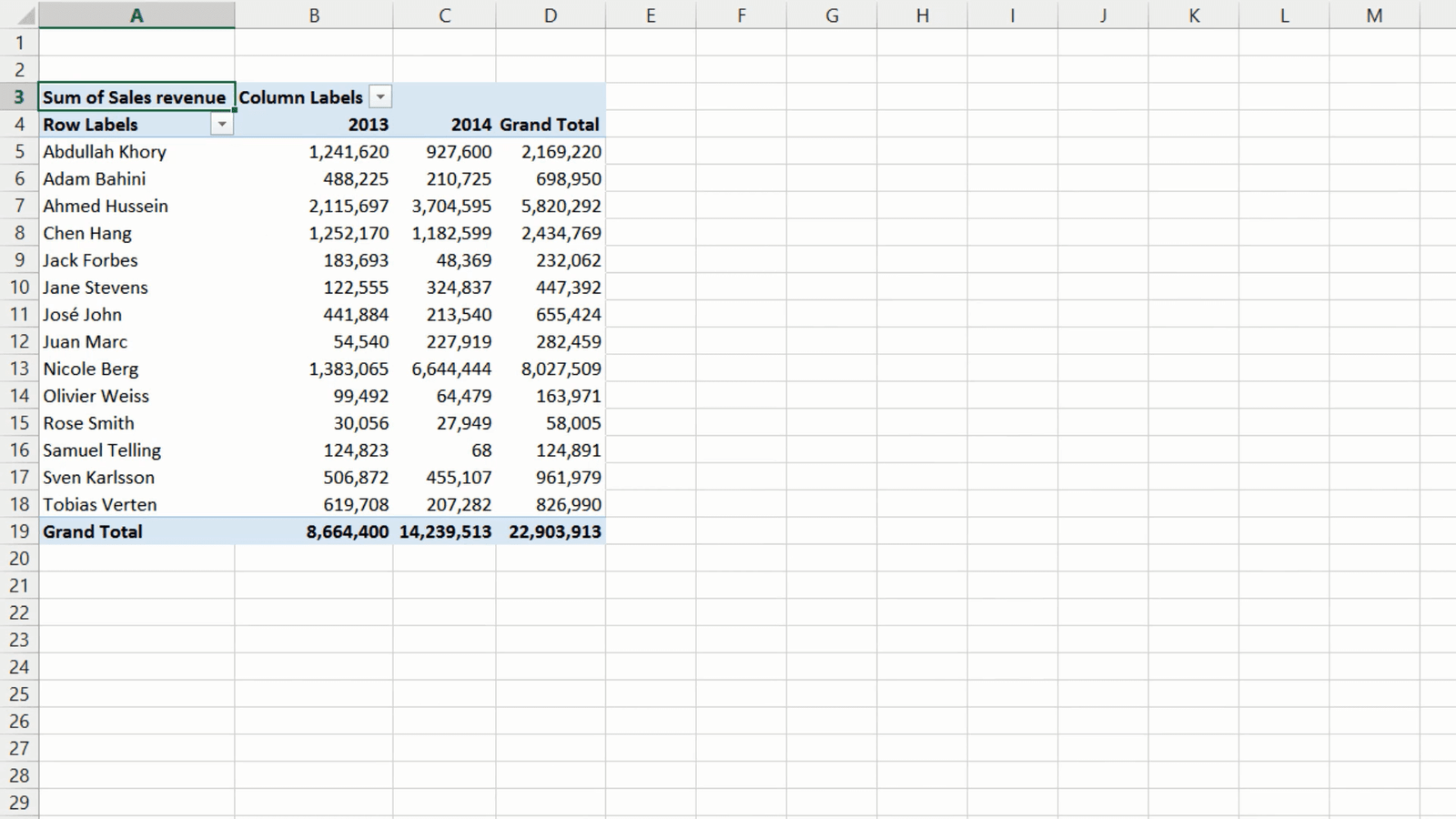
To analyze data in a PivotTable you need to add number fields to the Values area. I’ll select the “Sales Revenue” field, since this is a numerical data type, it is automatically added to the Values area. Right away you can see the total sum of sales revenue for 2013 and 2014 combined. To see the breakdown per year, drag the “Sales Year” field and place it in the Row labels area. Now you can easily compare the sales for 2013 with the sales for 2014.
To break down the sales by month, I’ll select “Sales Month” and put it under “Sales Year”. Now I can see the breakdown per month. I will move the “Sales Year” field to the Columns Area to make it easier to compare the months side by side.
To close down the PivotTable task pane just click anywhere outside the PivotTable. To open it up again click any cell in your PivotTable.
Changing the number format (03:00)
To make the PivotTable easier to read you can change the way the numbers are displayed. To change the number format, right-click any number cell and select “Number format”. Here I’ll select “Number”, I’ll remove the decimals and add a thousand comma separator. I’ll click OK to apply the changes. Now the numbers are easier to read.
Changing how values are shown (03:24)
By just looking at the data in the PivotTable I can see that we had the largest sales revenue in May 2014. To see what percentage this is of the Grand Total sales, right-click and select “Show Values As” and select “% of Grand Total”.

I can immediately see that May 2014 alone accounted for 7.74 percent of the grand total sales revenue for the two years. To see how much it accounted for in 2014 right-click again and select “Show Values As”, % of Column Total. Now I can see that it accounted for 12.45 percent of the year total. To go back to showing the sum of sales revenue again, I’ll right click, select “Show Values as” and select “No calculations”.
Changing how values are calculated (04:15)
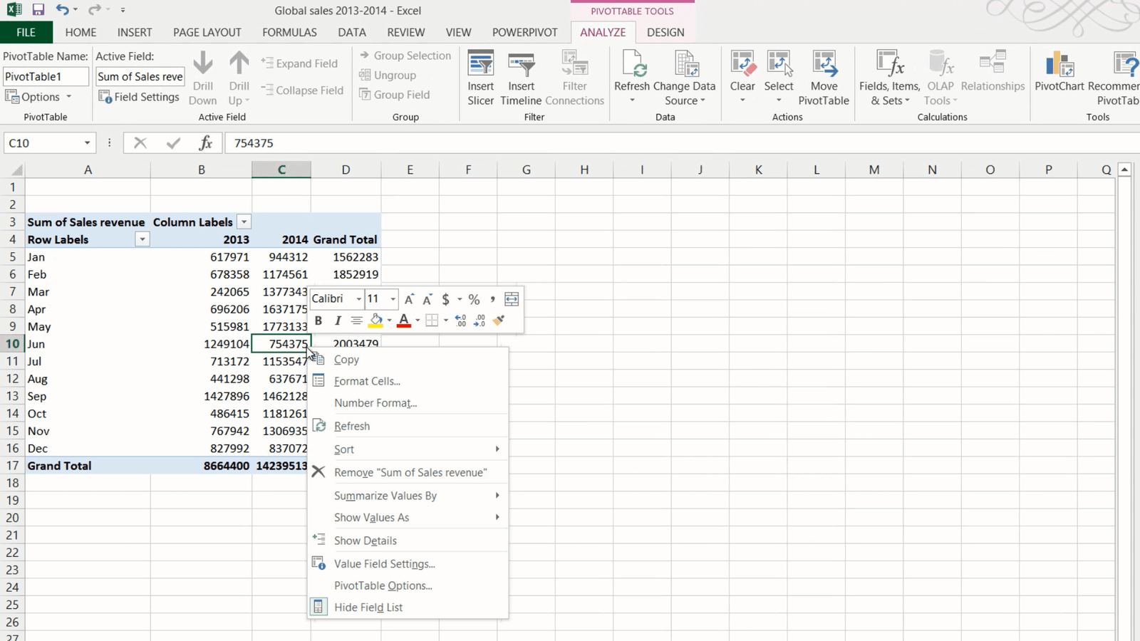
By looking at the data like this I can see the total sales revenue each month. To understand the number of transactions, you can change the calculation method. To change how values are calculated, mark a number cell and right-click, select “Summarize Values by” and then select your calculation method.

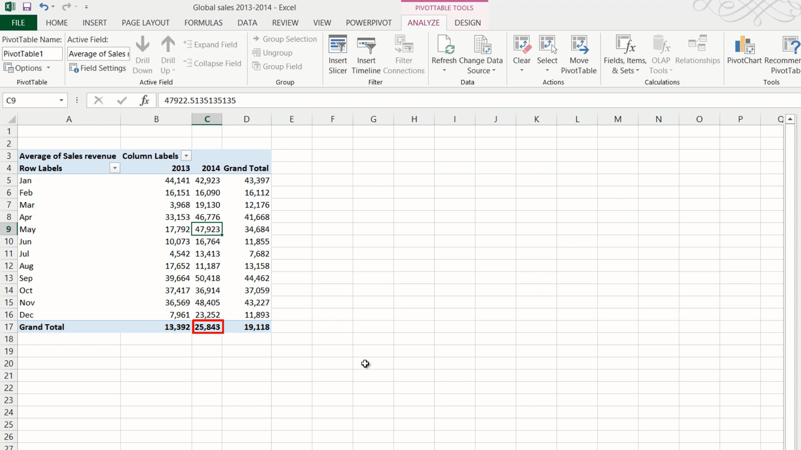
In this case I’ll select “Count” and I can see that in May we did 37 deals which is less than in many of the other months. To see what the average deal size is right-click again select “Summarize Values By” and select “Average”, here I can see that the average deal size in May was approximately 48,000, much higher than the year average which was about 26,000. To go back to show the sum of sales revenue again, right-click and select “Summarize values by Sum”.
Drilling down to the details of the underlying data (05:10)
If you want to see the underlying data that is the basis for the aggregation in your PivotTable, just double-click the cell in the PivotTable. A new worksheet opens up showing you the data for that cell. Here I can see all the 37 transactions for the month of May 2014. By sorting the data by Sales Revenue I can see that Ahmed Hussein was the account manager that sold most of the largest deals. If you don’t need these details, you can just right-click the sheet and select “Delete” click “Delete” again to go back to your PivotTable.
Moving data around to see it from different perspectives (05:45)
To get a better understanding of the Account Manager’s performance I can change the fields of my PivotTable.
To see your data from different perspectives you can easily drag and drop data fields around. To remove a field just uncheck it in the field list, or drag it outside the PivotTable area until you see the Delete symbol. To see the performance of the Account Managers, I’ll add the “Account Manager” Field to the Rows Area. Now I can see how much each Account Manager has sold for.
Sorting and filtering data in your PivotTable (06.17)
To see which Account Manager sold the most in 2013 I can easily sort the data in my PivotTable. To sort a PivotTable on a specific column, just right-click any cell in the desired column and select “Sort”, here I’ll select “Largest to Smallest”.

Here I can see that Ahmed sold the most in 2013. To see who sold the most in 2014 I’ll right-click a cell in the 2014 column, select “Sort”, “Largest to Smallest”. In 2014 Nicole sold the most, much more than any of the other Account Managers. In addition to the sorting tools you can also use filters. To see the top 5 Account Managers in 2014, I’ll first select the Column filter and select only 2014 and click OK. Then I’ll click the Row filter, select “Value Filters”, “Top 10” and then change from 10 to 5 top items and click OK, and here I can see my 5 best performing Account Managers in 2014. To remove the filter again, just mark the filter icon and click “Clear filter”, or go to the Field list and click the Filter icon there to clear the filter.

Changing the look and feel of your PivotTable (07.37)
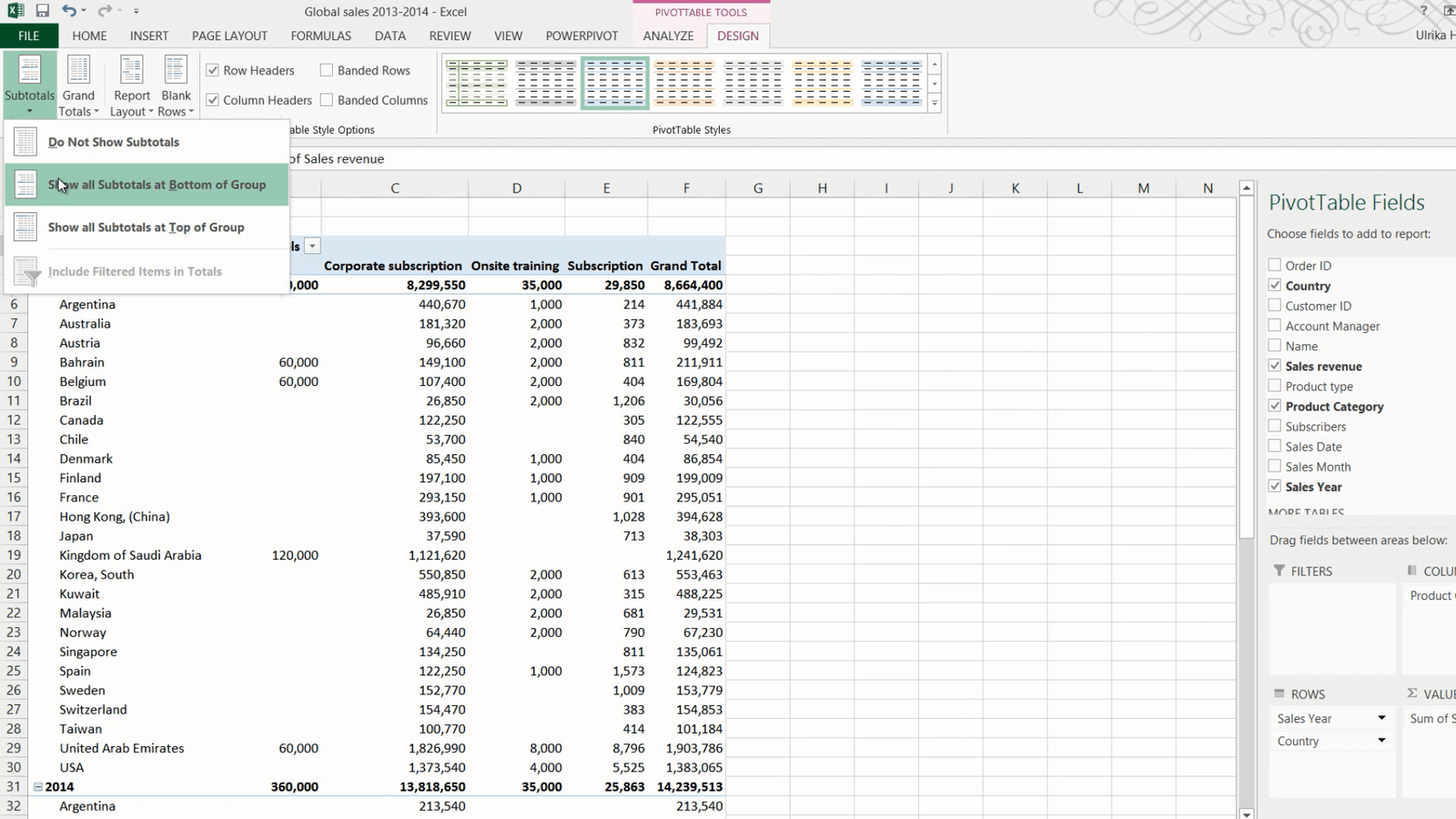
I’ll re-arrange the PivotTable again to see the product category sales in each country. I’ll deselect the “Account Manager” check box and move the “Sales Year” field to the Row area, and move the “Product Category” to the column area and “Country” to the row area.
To change the layout of the PivotTable click the PivotTable Tools “DESIGN” tab. To change the way the subtotals are displayed click “Subtotals”. I want to display the subtotals for each column under the column instead of on top, so I’ll click “Show all Subtotals at Bottom of Group”. You can also change how Grand Totals are shown. Here I’m just interested to see the Grand Total per Category so I’ll click “Grand Total” and select “On for columns only”.
To add more space between each section, click “Blank Rows” and then “Insert Blank Line after Each item.” Now it’s easier to see each year separately.
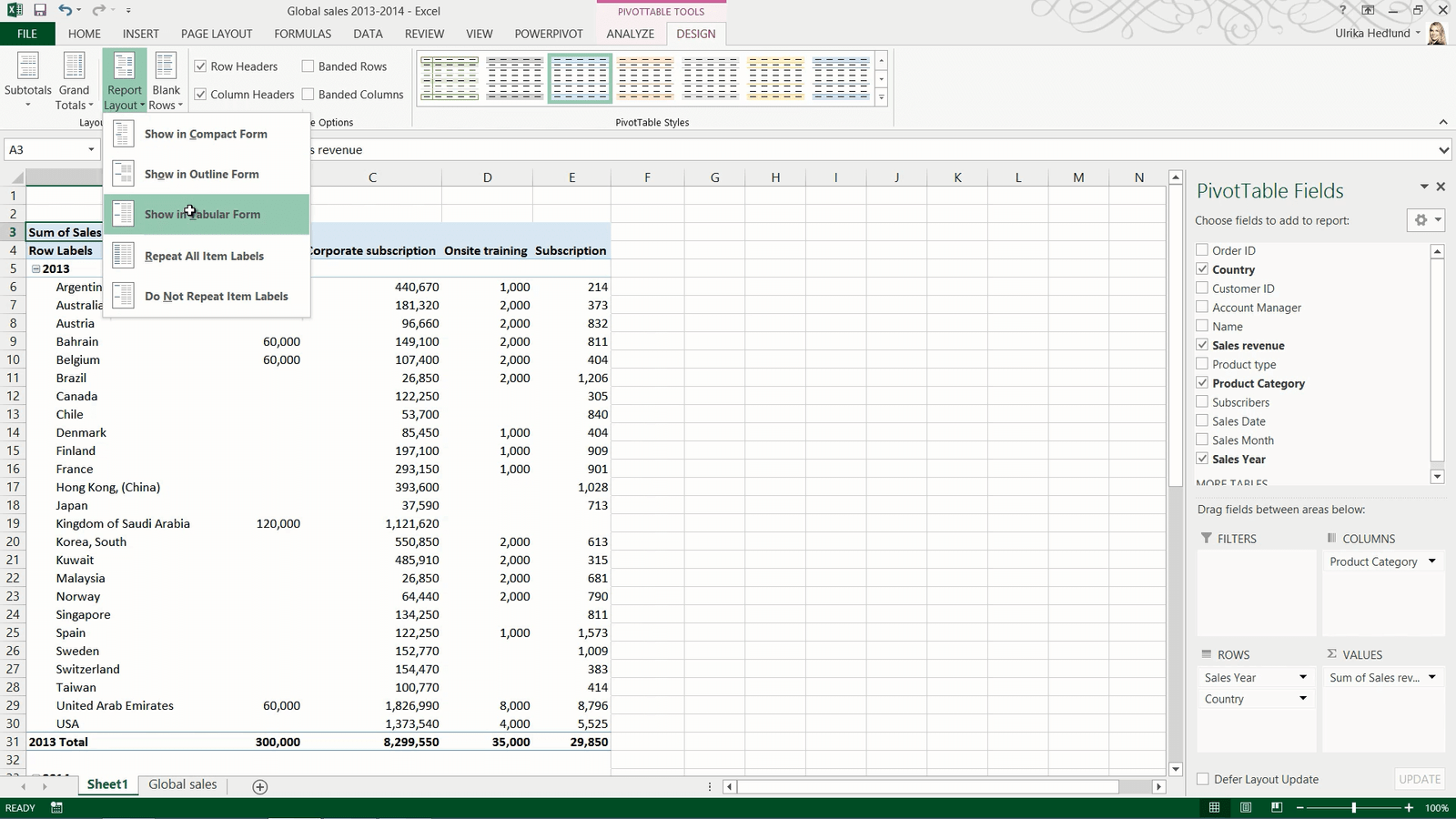
You have a number of options for changing the PivotTable design. Click “Report Layout” to select between different styles. If you select “Show in tabular form” you see each value in its own cell. In order to see all fields when you are scrolling up and down in your PivotTable click “Report Layout” and select “Repeat all Item Labels”.
Here I’ll click “Undo” and go back to the compact view which frees up more space.
If you find it hard to see which number belongs to what row, on the “DESIGN” tab, in the “PivotTable Style Options” section, check the option for “Banded rows”. For now I will just uncheck this option.
In this PivotTable, there are a number of empty cells, if you prefer to see these cells as zero, right-click any cell and select “PivotTable Options” under the “Layout and Format” tab, type in zero where it says, “For empty rows show”. Click Ok to apply the change.
Closing (09:45)
Now you can continue with your analysis and slice and dice your data to find valuable business insights.
Leave a Reply